
A scan is not a booking
QR codes are often treated as the campaign. Print the code, place it on a poster, wait for bookings. That is the easy part. The harder part is what happens after the scan.
A person who scans a code has shown a small amount of intent. They might want a table, a consultation, a haircut, a demo, a class, a repair visit or a ticket. They have not promised to complete a form. If the journey is slow, confusing or badly matched to the setting, the booking disappears.
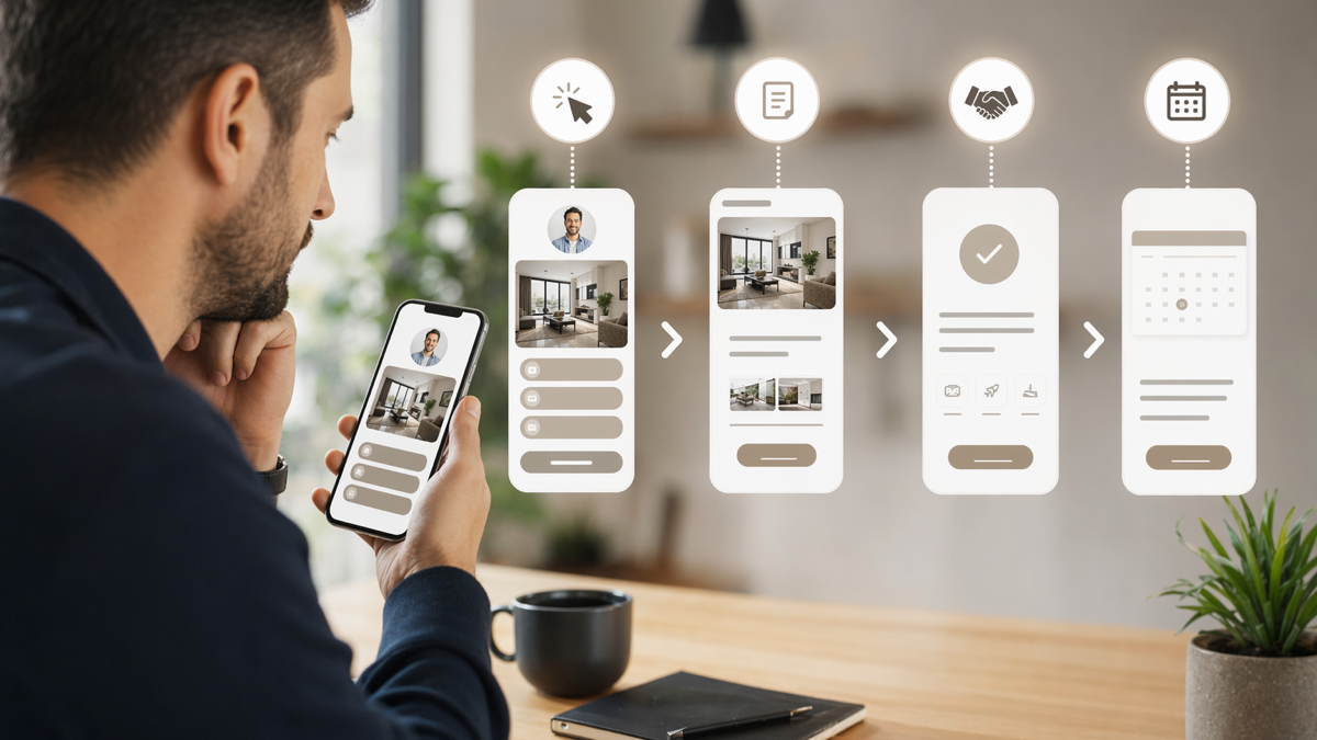
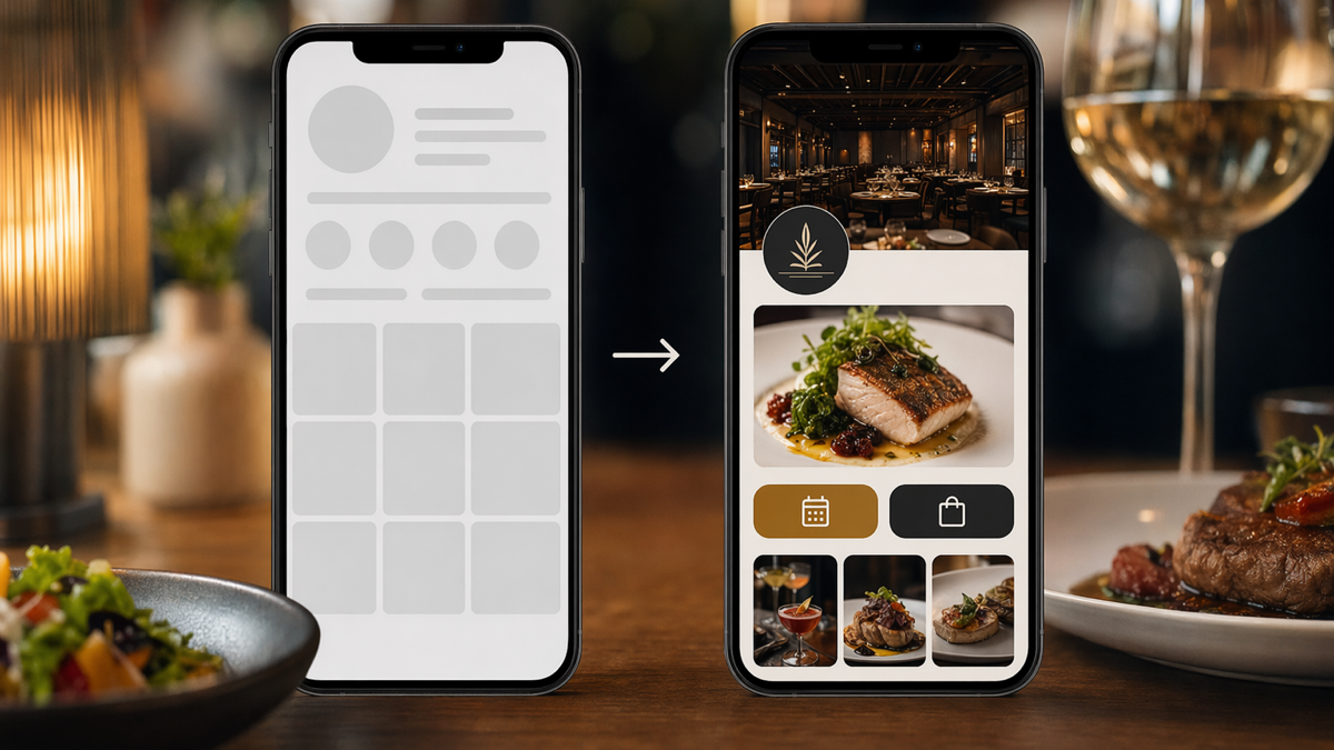
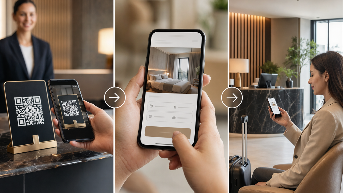
A better QR-to-booking journey treats the scan as the doorway, not the destination. It gives the visitor enough context to feel confident, asks for only the information needed at that moment, and makes the booking path work properly on a phone.
This matters for restaurants, clinics, salons, gyms, event organisers, trades businesses, venues, consultants and local services. Anywhere a physical touchpoint can lead to an appointment, reservation or call-back, the journey after the scan decides whether interest becomes action.
Start with the physical moment
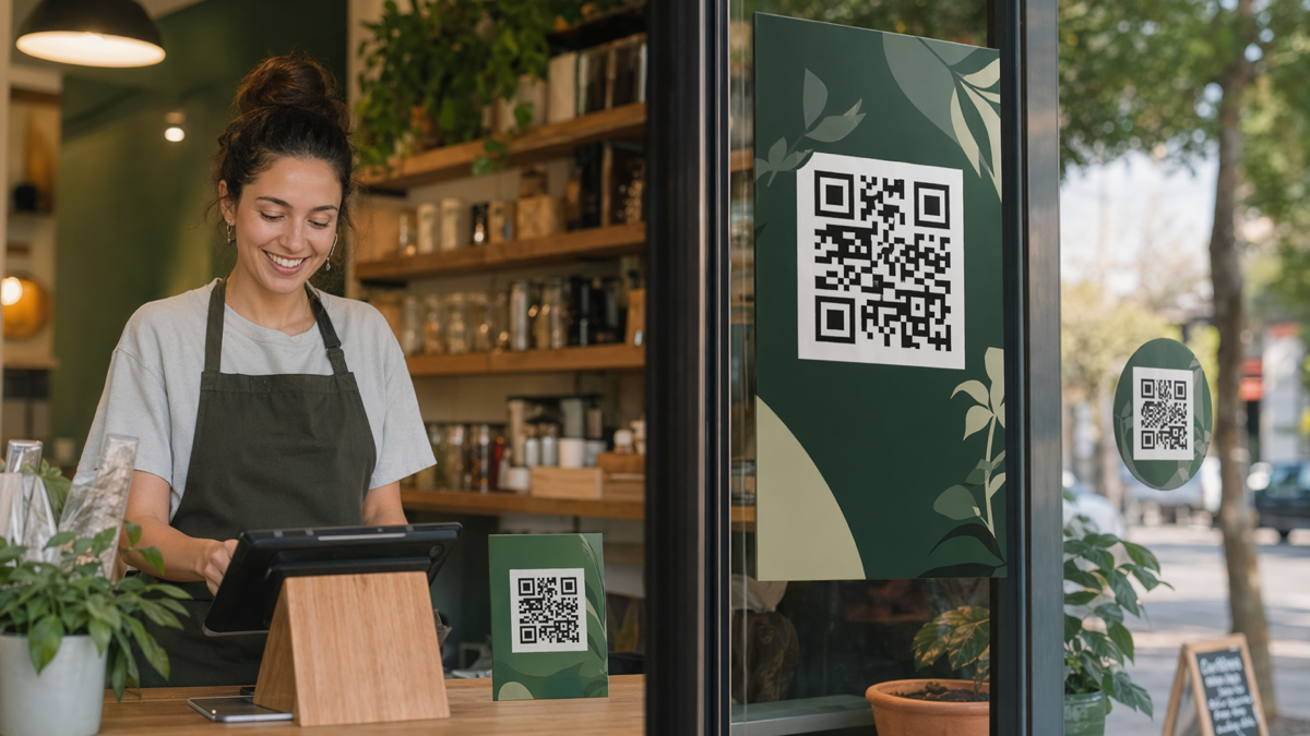
The right booking journey depends on where the person is when they scan. A QR code on a restaurant window is different from one on a table tent. A code on a trade van is different from one on an invoice. A code on a conference poster is different from one on a closing slide.
Before building the page, ask:
- Where is the code being scanned?
- What does the person already know?
- What are they likely trying to book?
- How much time do they have?
- Are they indoors, outside, seated, walking or queuing?
- Will they have good signal?
These details should shape the page. Someone scanning a salon mirror card while waiting for an appointment may have time to browse future treatments. Someone scanning a poster in a station needs the fastest possible path. Someone scanning from a boiler sticker probably wants service or repair options, not the full company story.
Make the promise beside the code specific
The text next to the QR code sets expectations. "Scan me" is weak because it gives no reason. "Scan to book a free roof check" is stronger. "Scan for Friday tables" is stronger still if that is the actual offer.
Good scan prompts are short and specific:
- Scan to book a boiler service
- Scan for today's availability
- Scan to reserve a table
- Scan to book your free trial class
- Scan to request a call-back
- Scan to choose your consultation slot
The landing page must then keep that promise. If the prompt says "book a free trial class", the page should not open with a general gym homepage. It should show the class options, trial details and booking button. Every mismatch creates doubt.
Give enough context before asking for details
Some booking pages rush straight into a form. That can work for repeat customers, but new visitors often need reassurance first. They want to know what they are booking, what it costs, where it happens and what to expect.
A good QR booking page usually needs:
- A clear title that matches the scan prompt.
- One or two lines explaining the offer.
- Price or starting price where possible.
- Location or service area.
- Available days or response time.
- What happens after booking.
- Cancellation or deposit notes if relevant.
This does not need to be long. In fact, it should not be. The aim is to answer the questions that stop someone booking. For a restaurant, that might mean menu, opening times and deposit policy. For a consultant, it might mean who the call is for and whether it is sales-heavy. For a trades business, it might mean coverage area, typical response time and whether photos help.
Keep forms short, then collect detail later
Long forms kill QR journeys. People scanning from a phone are rarely in the mood to fill out ten fields. Ask for the minimum needed to secure the booking or start the conversation.
For many booking journeys, the first step can be as short as:
- Name.
- Phone or email.
- Preferred date or time.
- Service type.
- Postcode if location matters.
Extra detail can come later through confirmation emails, follow-up calls or optional fields. If photos are genuinely useful, allow upload but do not make it painful. If you need payment or deposit, explain it before sending people to checkout.
There are exceptions. Medical, legal and financial bookings may need more information for compliance. Even then, split the journey where possible. Secure the appointment first, then collect sensitive details in a proper intake process.
Show availability early
Availability is one of the biggest reasons people continue or leave. If someone scans to book and cannot see whether anything is open, they may not bother. Show dates, times or at least a realistic response promise early in the journey.
For businesses with live calendars, connect the QR journey directly to the booking tool. For businesses that schedule manually, be honest. "Request a call-back today" may be better than pretending to offer instant booking.
Examples:
- A clinic shows the next available appointment types before asking for personal details.
- A restaurant lets visitors choose party size, date and time immediately.
- A tutor asks for subject and year group, then offers a short consultation slot.
- A roofer offers inspection request slots after storms, with a note about response times.
- A venue shows viewing appointments and private hire enquiry options separately.
If availability is limited, say so plainly. Do not use fake countdowns. Real scarcity is useful information. Fake pressure damages trust.
Design for in-app browsers and weak signal
Many QR scans open inside a phone's camera browser or a social app browser. These environments can behave differently from Safari or Chrome. Payment windows, file uploads, calendars and embedded booking widgets may not work as expected.
Test the journey in the same way a customer will use it. Print the code or display it on the actual material. Scan it with a phone. Complete the booking on mobile data. Try both iPhone and Android. Try poor lighting if the code will be used outdoors or in a venue.
Common technical problems include:
- Booking widgets that load too slowly.
- Pop-ups blocked inside in-app browsers.
- Payment pages that fail after redirect.
- Forms that are difficult to complete with one hand.
- Address fields that do not work well on mobile.
- Calendar tools that open in the wrong timezone.
Where possible, keep the first page lightweight. Avoid huge image sliders and unnecessary scripts before the booking action. The visitor did not scan to admire your animation. They scanned to do something.
Use different codes for different booking contexts
A single booking link used everywhere hides useful information. If you place the same QR code on a poster, table card, receipt and window sticker, you will not know which one produced bookings. Separate codes let you improve the journey by context.
For example, a restaurant could use:
- window-weekday-lunch
- table-card-private-hire
- receipt-review-and-rebook
- hotel-partner-dinner-booking
A clinic could use:
- poster-new-patient-consultation
- aftercare-card-follow-up
- local-gym-partner-screening
- reception-desk-repeat-booking
Each code can lead to a tailored page. The receipt code might focus on rebooking. The partner code might explain the partnership offer. The aftercare card might prioritise follow-up appointments. This is more useful than treating every scanner as the same person.
Reduce anxiety around the booking
Bookings carry small risks for the customer. Will I be charged? Can I cancel? Will someone call me repeatedly? Is the business legitimate? Am I choosing the right service? A good journey handles these worries before they become reasons to leave.
Add reassurance close to the booking action:
- No payment needed today, if true.
- Free cancellation up to a stated time, if true.
- We will confirm by text within one working day.
- Bring photos or measurements if you have them.
- Choose "not sure" if you do not know the service type.
- Your details are only used for this booking.
Use plain language. If a deposit is required, explain why and when it is refundable. If a call-back is part of the process, say when it will happen. Silence creates uncertainty, and uncertainty reduces bookings.
Follow up when someone starts but does not finish
Some visitors will scan, start the journey and leave. That does not always mean the campaign failed. They may have been interrupted, unsure about dates or waiting to check with someone else. If your tools allow it and your consent process is sound, follow-up can recover some of that interest.
Useful recovery tactics include:
- Saving partial enquiries when someone submits contact details first.
- Sending a reminder email for abandoned booking steps, with consent.
- Offering a "not ready to book? ask a question" route.
- Retargeting campaign visitors where appropriate and compliant.
- Using a shorter call-back form for people who cannot choose a slot.
Do this carefully. Nobody wants to feel chased because they scanned a poster. Make follow-up useful, limited and relevant.
Measure the full journey, not just scans
A QR campaign can look busy while producing few bookings. Scans are only the first signal. The useful measure is how many people completed the intended action and what those bookings were worth.
Track the journey in stages:
- Code scans by placement.
- Landing page views.
- Booking button clicks.
- Form starts.
- Completed bookings or requests.
- Confirmed attendance or completed appointments.
- Revenue or repeat bookings where relevant.
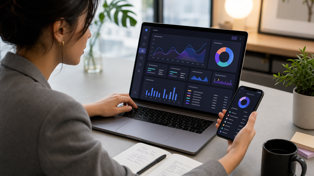
Looking at stages shows where the journey leaks. Lots of scans but few page views may suggest a technical issue. Lots of page views but few booking clicks may mean the offer is unclear. Lots of form starts but few completions usually means the form is too long or something is broken.
Review by placement too. A poster may drive awareness but weak bookings. A receipt code may have low scan volume but excellent rebooking rates. Both can be useful if you understand their role.
A better journey in practice
The weak salon version
Take a salon promoting colour consultations from a window poster. The weak version says "scan me" and opens the homepage. Visitors then have to find services, choose colour, read staff bios and locate the booking tool. Many will drop off.
The clearer salon version
A better version says "scan to book a free colour consultation". The QR code opens a page titled "Free colour consultation in Bristol". The page explains that the appointment takes 20 minutes, includes a patch-test note, shows the next available slots and asks for name, phone, preferred stylist and hair goal. A small reassurance line says no payment is needed to book.
After booking, the confirmation page gives preparation notes and offers an optional link to upload inspiration photos. The salon tracks scans from the window poster separately from Instagram and in-salon cards. After a month, it can see which placement produced real consultations.
The journey is not complicated. It is just aligned: the prompt, page, form, confirmation and tracking all point to the same booking.
Set up one journey before printing everywhere
If you are new to QR booking flows, start with one high-intent placement. Choose a service people already understand and a booking action that matters. Build the page, test the code, complete the form yourself and ask someone outside the business to try it.
Check these before launch:
- The scan prompt matches the page title.
- The page loads quickly on mobile data.
- The booking action is visible without hunting.
- The form asks only for necessary details.
- Availability or response time is clear.
- Confirmation explains what happens next.
- The code is tracked separately from other placements.
Once that works, expand. Add codes for other placements, offers or audiences. Keep the tracking clean so you can learn rather than guess.
Turn scans into appointments, reservations and call-backs
A better QR-to-booking journey is specific, fast and honest. It starts with the physical moment, gives a clear reason to scan, keeps the promise on the landing page and removes avoidable friction from the booking step.
If you already use posters, packaging, table cards, receipts, vans or event signage, you probably have places where a better booking journey could work. The improvement may be as simple as changing the scan prompt, building a dedicated page and tracking each placement separately.
To create trackable QR codes and short links for your next booking journey, set up a D2eak.link account and give each placement its own measurable route.
Final thought
People do not scan QR codes because they enjoy scanning QR codes. They scan because they want something. A table. A slot. A call-back. A ticket. A service visit. When the journey respects that, the code stops being a novelty and becomes a practical booking tool.
Related reading
If this topic is useful, these related D2eak.link guides are worth reading next: