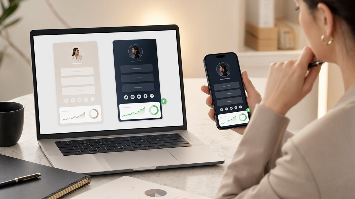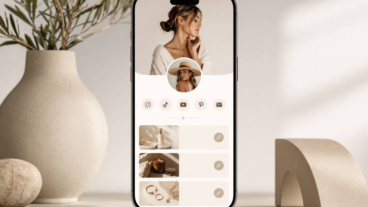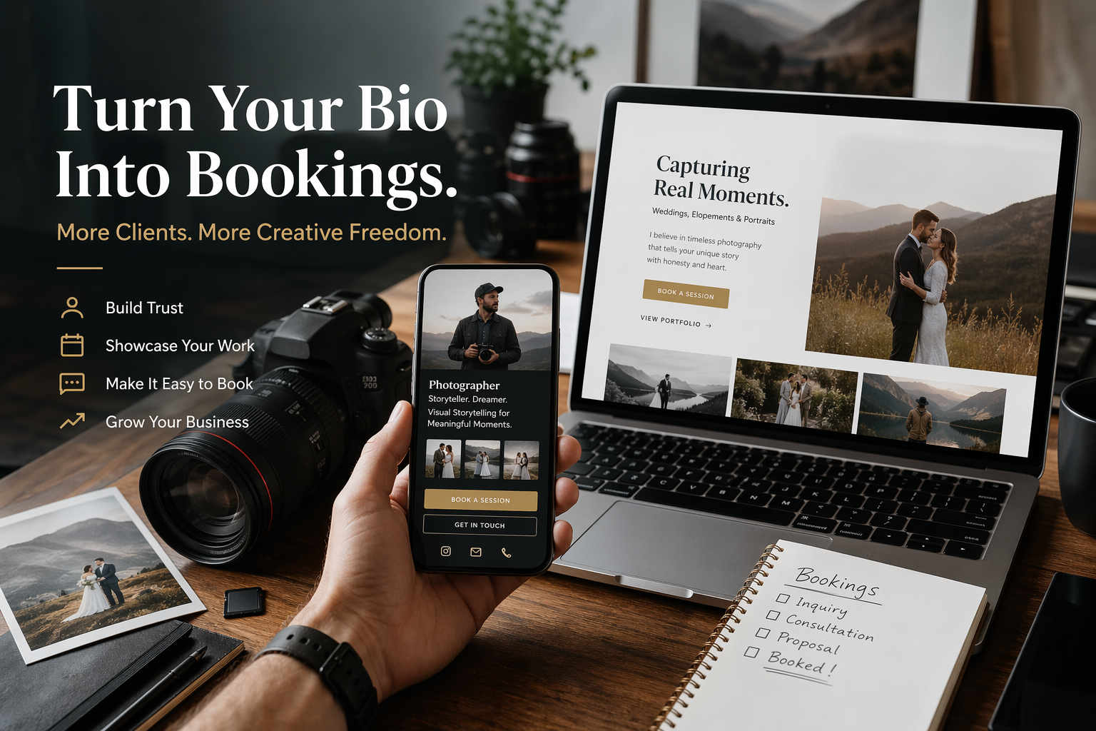

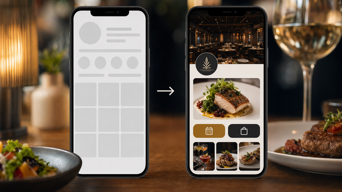
the profile page was doing too many jobs badly
The restaurant had a familiar problem. People found it on social media, through local searches, on review sites and from QR codes in the neighbourhood. They were interested enough to click. Then the profile page made them work too hard.
The page had a logo, a short description, a few photos, a menu PDF, a booking link and links to delivery platforms. That should have been enough. In practice, it felt messy. The booking link was not the most visible action. The menu opened slowly on phones. The delivery links were mixed in with social links. A customer who wanted to book a table, order takeaway or check opening hours had to stop and think.
For a restaurant, that pause matters. Hungry people are impatient. They are often walking, sitting in a car, planning with friends or comparing three places at once. A profile page does not need to be clever. It needs to help them make the next move quickly.
what the restaurant wanted
The owner did not ask for a full website rebuild. They wanted the existing traffic to convert better. More bookings. Fewer messages asking for the menu. Fewer customers tapping the wrong delivery option. Better use of QR codes on posters, table cards and receipts.
The restaurant also wanted one link for its social profiles. Staff were tired of updating separate bios whenever the booking platform changed or a seasonal menu went live. They wanted a single profile page they could keep current without waiting for a developer.
The goal became quite practical:
- make booking the easiest action for diners who wanted a table
- make the menu fast to open on mobile
- separate delivery, booking and social actions clearly
- use QR codes that could be updated without reprinting everything
- give the owner a simple way to see which links people used
the old page was not broken, just unclear
It is easy to be too harsh about a page like this. The old version was not ugly. It had the right ingredients. The problem was priority.
The first visible link was a general website link. The booking link came lower down. The menu PDF had a vague title. Delivery partners were listed in an order that made sense to staff but not to customers. Opening hours were in an image, which looked fine on a large screen but was awkward on a phone. The Instagram link sat near the top even though most visitors were arriving from Instagram in the first place.
That meant the page was spending attention on people who had already arrived, rather than helping them decide.
the new structure
The team rebuilt the profile page around customer intent. Instead of listing everything equally, it grouped actions by what someone was trying to do.
book a table
The booking action moved to the top. The button text was changed from "Reservations" to "Book a table". That sounds minor, but plain language matters. A person scanning on a phone should not have to translate restaurant jargon.
view the menu
The menu link became a fast mobile-friendly page rather than a heavy PDF wherever possible. When a PDF was still needed, the link label said exactly what it contained: "View the dinner menu" or "View the lunch menu".
order takeaway
Delivery options were grouped together below booking and menu. The restaurant kept the most used platform first and removed a partner that was no longer active. This stopped customers from tapping a dead route and blaming the restaurant.
find us
Address, opening hours and map directions were kept close together. The team also added a short note for the nearest parking option because staff were answering that question several times a week.
why link order changed the page
Many profile pages fail because they treat every link as equally important. They are not. On a restaurant page, a booking link is usually worth more than a generic social link. A menu link is more useful before someone books. Directions matter more when someone is already nearby.
The new page used a simple order:
- Book a table
- View the menu
- Order takeaway
- Get directions
- Opening hours
- Social profiles
This was not meant to be universal. A takeaway-only restaurant would lead with ordering. A fine dining restaurant might lead with reservations and private dining. The point is that the page should reflect the customer decision, not the order in which staff happened to add links.
the QR code problem
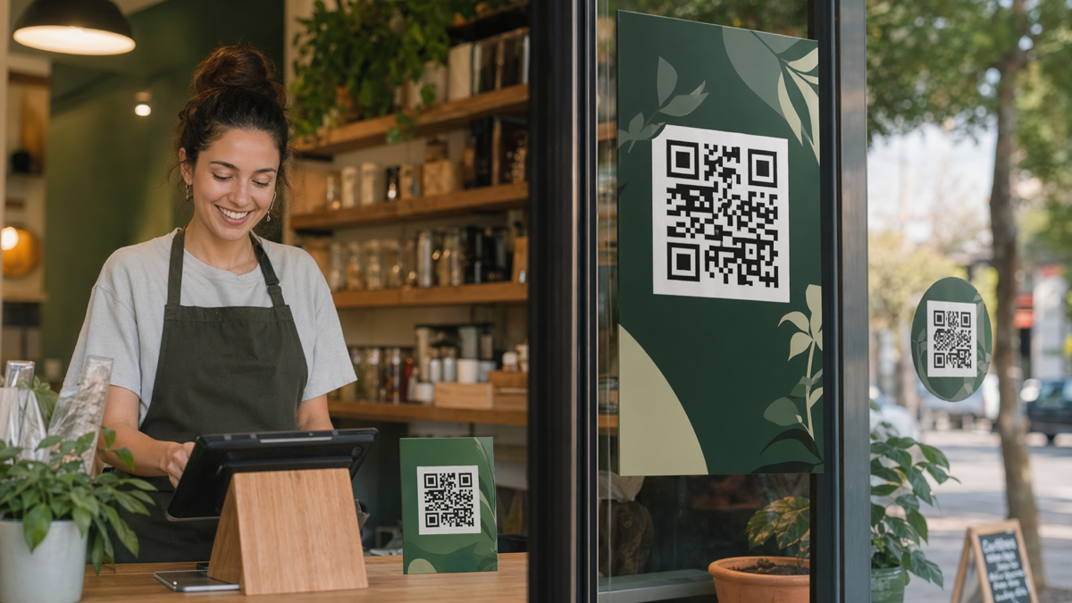
The restaurant already used QR codes, but they were scattered. One code pointed to an old menu. Another went to the homepage. A poster in the window had a code that still worked, but nobody knew who created it. That made the owner nervous about changing anything.
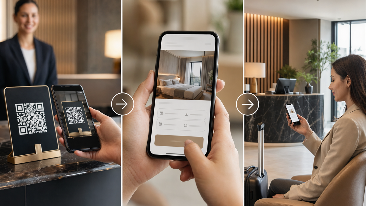
D2eak.link helped by putting the QR codes behind manageable short links. The restaurant could create one QR code for the profile page and another for the menu. If the menu changed, the destination could be updated without reprinting table cards. If the booking platform changed, the profile page could be updated once rather than editing every social bio and poster.
The practical setup looked like this:
- a main profile link for Instagram, TikTok and local listings
- a menu QR code for tables and window posters
- a booking QR code for event flyers
- a takeaway QR code for receipts and bag inserts
Each QR code had a clear purpose. That stopped the restaurant from using one generic code everywhere and then wondering why the data was hard to read.
small copy changes that helped
The page did not need big sales writing. It needed clear labels. The team replaced vague or internal phrases with customer language.
- "Reservations" became "Book a table".
- "Menu PDF" became "View the dinner menu".
- "External ordering" became "Order takeaway".
- "Location" became "Get directions".
- "Contact" became "Call the restaurant".
These edits were small, but they changed the feel of the page. The visitor no longer had to decode the restaurant's internal language. Each action said what would happen next.
the mobile test
The owner and manager tested the new page the way customers would use it: on phones, quickly, with distractions. They opened it from Instagram, scanned the QR code in the window, tapped the menu link and tried to book a table for Friday night.
That test caught a few things that would have been missed on a laptop. The booking platform opened in a new page and took a moment to load, so the team made sure the button label was clear before the tap. The map link worked well on one phone but opened awkwardly on another, so they adjusted the destination. A food photo looked good on desktop but cropped badly on mobile, so it was replaced.
This kind of testing is not glamorous, but restaurants should do it. If a customer cannot book from a phone in less than a minute, some of them will choose somewhere else.
what the restaurant watched after launch
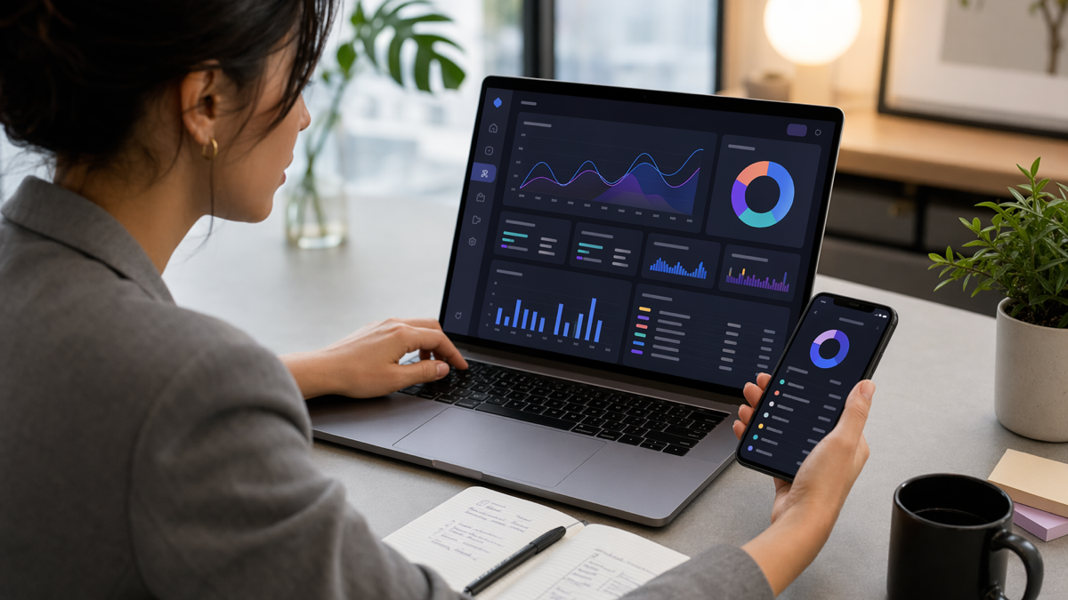
The restaurant did not need a complicated dashboard. It watched a few basic signals during the first weeks after the change.
- Which profile buttons were clicked most often?
- Did the menu QR code get used during service hours?
- Did booking clicks rise after the button moved to the top?
- Were people still messaging to ask for the menu or opening hours?
- Were any old links still getting clicks?
The last question was useful. Old links are easy to forget. If an old QR code is still getting clicks, you either need to update its destination or replace the printed material when you can.
what improved
The restaurant saw the clearest improvement in daily admin. Staff received fewer basic questions because the profile page answered them better. Customers had a cleaner path to the booking form. The owner could see whether the QR code on the window poster was being used, which helped decide where to place future printed material.
There was also less fear around updates. Seasonal menus are normal. Delivery partners change. Booking systems sometimes move. With a managed profile link and QR codes, the restaurant could make those changes without worrying that every printed asset would become useless overnight.
The page still needed care. A profile page is not something you fix once and ignore forever. The owner added a monthly check:
- open every button on a phone
- check that the menu is current
- confirm opening hours
- remove old offers
- scan the table QR code from the room itself, not from a saved file
That small habit kept the page from drifting back into mess.
lessons for other restaurants
If your restaurant relies on social traffic, local listings or QR codes, your profile page is part of the front door. It may not feel as important as the dining room, but it shapes the decision before someone arrives.
A better page usually starts with a few honest questions:
- What do most visitors want to do first?
- Can they do it with one tap?
- Are link labels written in customer language?
- Do QR codes point to pages you can update?
- Can staff check the page without asking a developer?
You do not need to turn the page into a mini website. In fact, that can make it worse. Keep it focused. Give people the actions they came for. Put the most valuable action first.
make your restaurant links easier to manage
D2eak.link gives restaurants a simple way to manage short links, profile pages and QR codes from one place. If your menu, booking and delivery links are spread across old bios and printed codes, create a D2eak.link account and rebuild the path around what customers actually need.
the takeaway
The restaurant did not win more attention by adding more links. It made better use of the attention it already had. A clearer profile page turned scattered interest into cleaner actions: book, view the menu, order, visit. That is what a good conversion page should do. It should not make customers admire the structure. It should quietly get them to the next step.
Related reading
If this topic is useful, these related D2eak.link guides are worth reading next: