
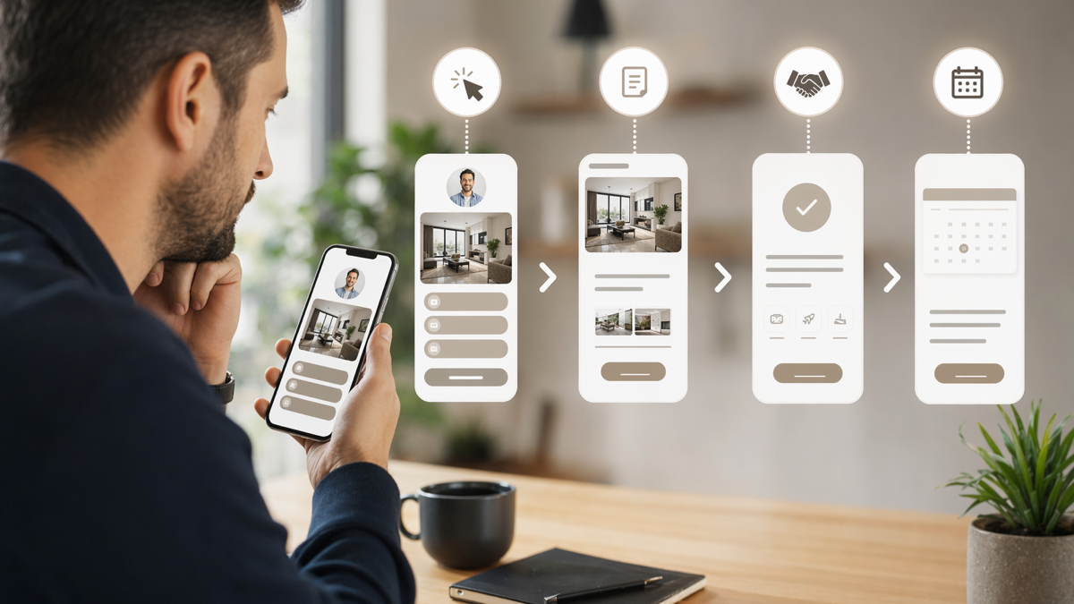
Most link-in-bio pages ask too much of the visitor
A link-in-bio page often starts with good intentions. Someone wants one place for everything: shop, newsletter, podcast, booking link, latest article, YouTube, TikTok, affiliate links, press page and maybe a free download. It feels tidy from the creator's side because all the links are in one place.
From the visitor's side, it can feel like a drawer full of cables. They tapped because one post caught their attention. Now they have to work out which of twelve buttons matches the thing they wanted. Many will leave rather than think about it.
A better link-in-bio funnel is not just a prettier list of links. It is a short decision path. It understands where the visitor came from, what they are likely trying to do, and what action matters most. It still gives options, but it does not treat every option as equal.
This is especially important for businesses, creators, consultants, venues and local services using social platforms as discovery channels. A profile visit is a small window of intent. The link has to make that intent easier to act on.
Start with one primary action
The first question is uncomfortable: what do you actually want people to do? If the answer is "everything", the page will probably underperform. A strong funnel chooses a primary action and makes the rest secondary.
Primary actions might include:
- Book a call.
- Join an email list.
- Buy a product.
- Register for an event.
- Download a guide.
- Request a quote.
- Listen to the latest episode.
- Claim a local offer.
The right choice depends on your model. A consultant may want discovery calls. A restaurant may want bookings. A musician may want pre-saves for a release. A gym may want trial passes. A charity may want donations or volunteer sign-ups.
Once you choose the primary action, the page can be organised around it. The top section should make the main offer obvious, with one clear button. Secondary links can sit below, but they should not compete visually with the main route.
Match the page to recent content
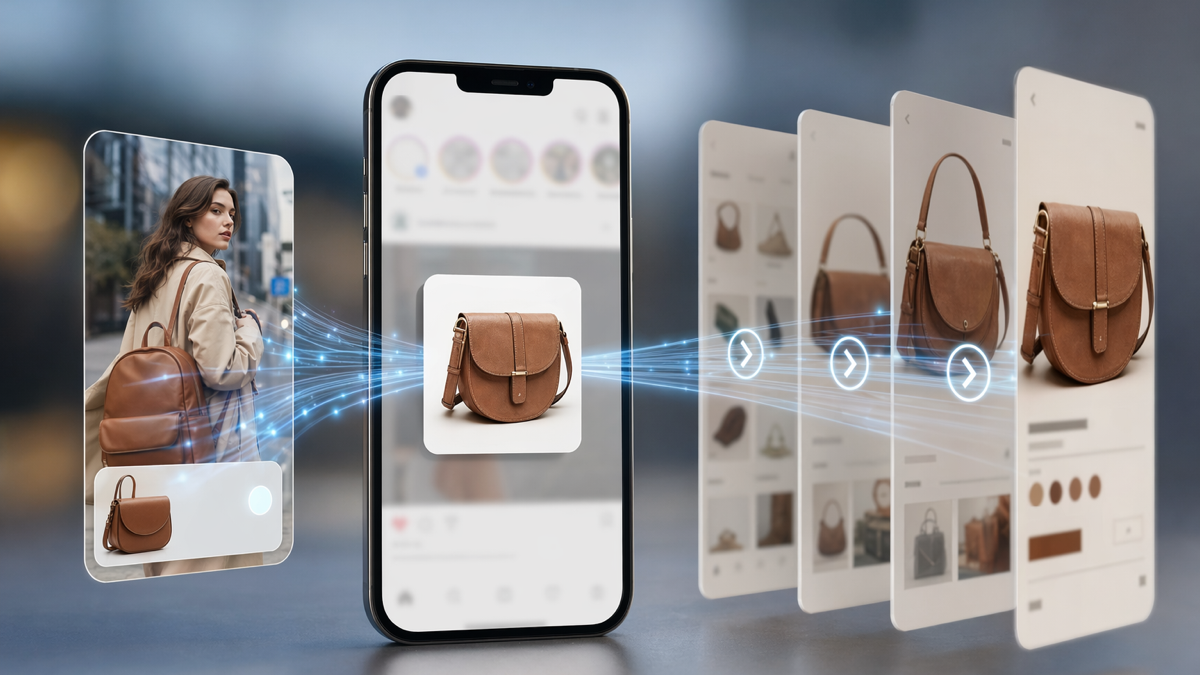
People rarely tap a bio link in the abstract. They tap because of something they just saw: a reel, a post, a story, a comment, an ad or a pinned thread. The landing page should acknowledge that context.
If your latest Instagram reel promotes a workshop, the first button should not be a generic "visit my website" link. It should be the workshop registration. If a LinkedIn post offers a hiring checklist, the top link should be the checklist. If a TikTok shows a new menu item, the top link should help people book or order.
This does not mean rebuilding the whole page every day. It means keeping the top section flexible. Rotate the primary card based on current campaigns while keeping evergreen links below.
Example: independent fitness coach
A fitness coach posts a reel about returning to training after injury. The bio link opens a page where the first card offers a free "back to training" assessment. Below that are links for online coaching, class timetable, testimonials and email sign-up.
That page works because the visitor gets what the post promised. If the page instead opened with six unrelated coaching packages, the visitor would have to interpret too much.
Example: local restaurant
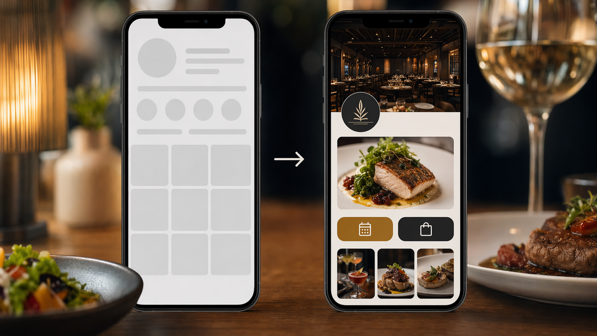
A restaurant posts a short video of its Sunday roast. The bio link top card says "book Sunday lunch" with available dates. Below that are the menu, private hire, gift vouchers and newsletter. The page supports the current demand without hiding the rest of the business.
Reduce choices without hiding important links
There is a balance between focus and usefulness. A page with one button may be too narrow for an audience with mixed intent. A page with twenty buttons is usually too much. The answer is grouping.
Instead of a flat list, organise links by intent:
- Start here: the current offer or most common next step.
- Work with us: booking, quote request, services or consultation.
- Latest: current campaign, launch, event or post resource.
- Proof: reviews, case studies, press or portfolio.
- Stay in touch: email list, community or social channels.
Use plain labels. "Book a table" beats "experience our dining concept". "Get the pricing guide" beats "discover our solutions". People scan quickly. Clever labels often cost clicks.
You can also use conditional routing. For example, one button might ask "what do you need?" and send visitors to separate paths for booking, pricing, support or resources. This is useful when different audiences visit the same profile.
Build trust before the click that matters
A link-in-bio funnel often asks for action too soon. If someone has never heard of you, they may need a little proof before booking, buying or submitting details. The trick is to add proof without turning the page into a full website.
Useful trust signals include:
- A one-sentence positioning statement.
- A clear photo or brand mark.
- Recent testimonials or review snippets.
- Client logos, if they genuinely help.
- Short proof points, such as years in business or number of customers served.
- Examples of recent work.
- Transparent pricing or starting prices where possible.
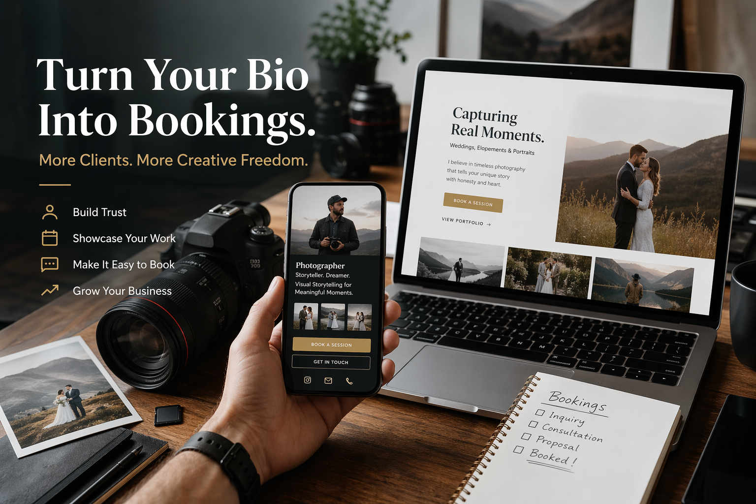
Keep it specific. "Trusted by busy founders to fix messy sales funnels" says more than "helping businesses grow". A bakery can mention same-day collection. A photographer can show three recent shoots. A tutor can state the subjects and age groups covered.
Proof should support the action. If the main CTA is a paid workshop, show attendee comments or outcomes from the last one. If the main CTA is a quote request, show relevant work and response times. If the main CTA is a newsletter, show what subscribers actually receive.
Make mobile speed and clarity non-negotiable
Almost every link-in-bio visit happens on a phone. That makes speed, spacing and thumb-friendly buttons more important than elaborate design. If the page jumps around, loads slowly or buries the main button, the funnel leaks.
Check the page on mobile data, not just office Wi-Fi. Look at it with tired eyes. Can you tell what the page is for in five seconds? Is the main button visible without scrolling? Are button labels readable? Does the checkout or booking form behave properly inside an in-app browser?
In-app browsers can be awkward. Instagram, TikTok and LinkedIn may handle forms, payment pop-ups and downloads differently. Test the whole path from profile tap to completion. Do not stop at "the page opens".
Common mobile mistakes include:
- Too many large images before the main button.
- Buttons with vague labels.
- Forms that ask for too much too early.
- Pop-ups that block the page on small screens.
- Payment or booking tools that fail inside social app browsers.
- Links that open old campaigns or expired offers.
Track links by platform and campaign
If the same bio link is used everywhere, the data becomes muddy. Instagram visitors may behave differently from LinkedIn visitors. A campaign post may attract warmer traffic than a general profile visit. Tracking helps you see the difference.
Use separate short links for each platform or campaign where it makes sense. For example:
- instagram-bio-main
- tiktok-bio-launch
- linkedin-profile-consulting
- youtube-description-guide
- spring-campaign-bio
The destination can be the same page, but the tracked link tells you where the visit came from. If you run time-limited campaigns, create separate links so you can compare results without guessing.
Do not drown yourself in data. Start with the questions you will actually act on. Which platform sends the most useful visitors? Which campaign drove email sign-ups? Which top-card offer produced bookings? Which links get clicks but no conversions?
A better funnel in practice
Imagine a small design studio using Instagram and LinkedIn to attract clients. Their old bio page has ten buttons: website, portfolio, services, shop, newsletter, podcast, pricing, contact, resources and YouTube. It is tidy, but it does not guide anyone.
A better version might look like this:
Top section
A short line says: "Brand and website design for independent food, drink and hospitality businesses." The main card says: "Book a 20-minute fit call". Under it, a small note says: "Best for restaurants, makers and venues planning a launch or refresh in the next three months."
Proof section
Two recent project thumbnails show a cafe rebrand and a wine bar website. A short quote from a client mentions that bookings increased after the launch. There is a link to view more work, but it is not the first thing on the page.
Current campaign
The studio is promoting a free menu design checklist from a recent LinkedIn post. A card says: "Get the menu checklist mentioned in today's post." This card moves up while the campaign is active, then drops lower later.
Secondary links
Below the main content sit links for pricing guide, newsletter, podcast and shop. They are still available, but they do not distract from the main booking route.
This version does not need to be fancy. It simply respects the visitor's likely intent and gives them a clearer path.
Use link order as a weekly habit
A link-in-bio funnel is not set-and-forget. It should change as your content, offers and availability change. The page does not need daily tinkering, but it does need regular attention.
A simple weekly review can cover:
- What did we post this week?
- What action do we want from that attention?
- Is the top link still the right one?
- Are any offers expired?
- Which links got clicks but no useful action?
- Should one link be removed, renamed or moved down?
This habit keeps the page connected to what people are seeing. It also stops old campaigns from lingering at the top. Nothing makes a funnel feel neglected faster than a "register now" button for an event that happened last month.
Write button labels like a human
Button labels do more work than people think. They set expectations and reduce hesitation. The best labels are plain and action-specific.
Better labels include:
- Book a free fit call
- Get the pricing guide
- Join the Friday email
- Reserve a table
- Download the checklist
- Ask for a quote
- Watch the latest episode
Weaker labels include:
- Learn more
- Click here
- Explore
- Discover
- Official site
Sometimes "learn more" is fine on a full website. On a link-in-bio page, it usually wastes a chance to be clear. Tell people what happens next.
When a link-in-bio page should send people somewhere else
The bio page is a gateway, not a replacement for every other page. Some journeys need more space. A high-ticket service may need a proper landing page. A product launch may need a sales page. A venue may need a booking engine. The bio page should route people there cleanly.
Think of it as the front desk. It greets people, asks what they need and sends them to the right room. It should not try to be the whole building.
For complex offers, use the bio page to pre-qualify. A short card can say who the offer is for, the starting price and the next step. That saves time for both sides and reduces low-quality enquiries.
Set up a sharper path from social attention
A better link-in-bio funnel is usually simpler than the one it replaces. It has a clear primary action, supporting proof, current campaign links and sensible secondary options. It changes when your content changes. It uses tracking so decisions are based on behaviour, not hunches.
If your social profile is sending people into a messy list, tidy the path. Choose the action that matters this month, put it first, and make every button earn its place.
To build trackable short links for each platform, campaign and top-card offer, create a D2eak.link account and start separating your bio traffic from the rest of your clicks.
Final thought
The best link-in-bio funnel feels obvious to the visitor. They should not notice the strategy behind it. They should just tap, understand the offer and take the next step. That is the job.
Related reading
If this topic is useful, these related D2eak.link guides are worth reading next: