
From flyer to checkout: building a trackable QR-to-conversion funnel
A flyer can still work, but only if it has a job. Too many flyers are designed like tiny posters: logo, offer, phone number, website, social icons and a QR code floating in the corner. They may look busy, but they are hard to measure and easy to forget.
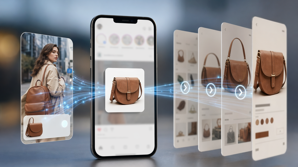
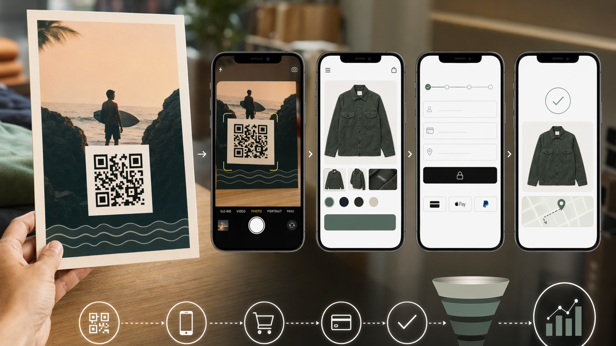
A modern flyer should act like the start of a funnel. Someone sees it, understands the offer, scans or types a short link, lands on a mobile page and takes the next step. That step might be checkout, booking, enquiry, download or reservation.
The useful part is that the journey can be tracked. With D2eak.link, you can create QR codes and short links that show which flyer placement produced attention and which landing page actions followed. You do not have to guess whether print worked.
Begin with the conversion, not the flyer
Before designing anything, decide what counts as success. "Get the word out" is too vague. A flyer should push one measurable action. If you cannot name the action, the customer will not know what to do either.
For an ecommerce brand, success might be checkout for a specific product. For a local class, it might be trial booking. For a restaurant, it might be table reservation. For a service provider, it might be a WhatsApp enquiry or quote request.
Good flyer goals
- Sell tickets for one event.
- Drive pre-orders for a lunch offer.
- Book trial sessions for a local gym.
- Get enquiries for a home service package.
- Send shoppers to a limited product bundle.
- Collect signups for an open day.
One flyer can include supporting information, but it should have one main action. Multiple equal calls to action make tracking messy and decision-making harder.
Write the offer in plain language
People usually glance at flyers. They do not study them. The offer should be obvious in a few seconds. Avoid clever lines that only make sense after reading the small print.
A strong flyer promise includes what the person gets, who it is for and why they should act soon. It does not need to be loud. It needs to be understandable.
Offer examples
- Book a free first boxing class this January.
- Scan for 15% off your first online order.
- Reserve a table for our Friday pasta night.
- Get the local moving checklist before you request a quote.
- Buy early bird tickets before Sunday night.
Match the landing page to the same promise. If the flyer says 15% off, the page should not make people hunt for the discount.
Create a dedicated QR code and short link
Do not use your homepage QR code on a flyer campaign. Create a dedicated QR code for that flyer or flyer placement. If you distribute the same flyer in several locations and the location matters, create separate codes for each batch.
Pair the QR code with a readable short link. Some people will not scan. Some will see the flyer in a photo. Some will want to type the link later. A short link also makes the flyer feel more trustworthy.
Setup examples
- /jan-trial-gym-window for flyers placed at the gym.
- /jan-trial-cafe for flyers left at a partner cafe.
- /pasta-night-table for table cards.
- /moving-checklist-estate-agent for a partner referral flyer.
- /earlybird-campus for university event flyers.
Use names that tell you where the flyer lived. Later, when the campaign is over, those names make the report readable.
Design the flyer around the scan
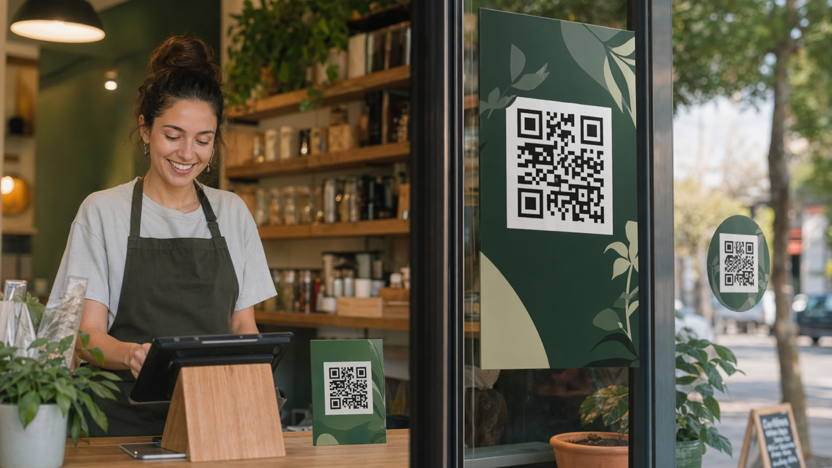
The QR code should not look like an afterthought. Give it space, put it near the action text and explain what happens after scanning. If the code is tiny, low contrast or surrounded by clutter, fewer people will use it.
Include the short link near the code. Keep the instruction specific. "Scan to buy" can work for simple products. "Scan to claim 15% off" is better when a discount is the hook. "Scan to reserve your table" is better for restaurants.
Print checks
- Scan the code from the expected viewing distance.
- Test a physical print, not only the design file.
- Check that the short link is readable in the final size.
- Keep the QR code away from folds, staples and glossy glare.
- Make the call to action larger than low-priority details.
A flyer does not have to win design awards. It has to get scanned by the people most likely to buy.
Build a mobile landing page for the flyer
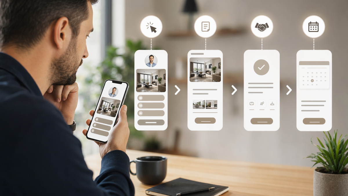
The scan will almost always happen on a phone, so the landing page must work on a phone. That means fast loading, clear headline, visible CTA and a checkout or booking path that does not fight the user's thumbs.
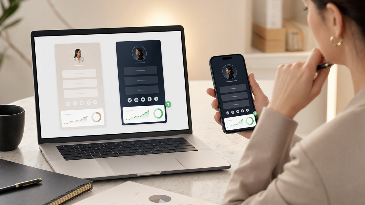
Do not send flyer traffic to a general category page unless the offer is broad. A dedicated landing page or D2eak.link bio page can keep the message tight. The headline should repeat the flyer offer so the visitor knows they are in the right place.
Landing page structure
- Headline repeating the flyer offer.
- Short explanation or terms if needed.
- Primary button to checkout, book or enquire.
- Small proof point such as review, rating or guarantee.
- Backup contact option for people with questions.
Remove navigation if it distracts from the action. A flyer funnel is not the place to show every product, post and profile you own.
Add tracking without making the URL ugly
The public flyer should show a clean short link. Behind that link, use tracking values that identify the flyer campaign, source and placement. This gives you readable print and useful analytics.
For example, the QR code can point to a D2eak.link short link that redirects to a checkout page with UTMs attached. The customer sees a short address. Your analytics sees the campaign source.
Useful tracking fields
- Source: the location or partner, such as cafe-counter or campus-board.
- Medium: qr or print.
- Campaign: the campaign name, such as spring-trial or pasta-night.
- Content: flyer-a or flyer-b if you are testing creative versions.
Do not over-tag everything. Track the pieces you may act on. If two locations would get the same future treatment no matter what, they do not need separate codes.
Measure scans, clicks and checkouts
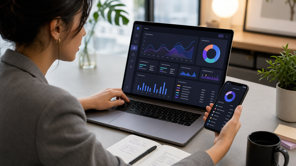
A scan is a sign of interest, not a sale. Track the full chain where possible: flyer distribution, QR scans, landing page clicks and checkout or booking completion.
If scans are low, the issue may be placement, offer or flyer design. If scans are high but checkouts are low, the landing page or offer may be the problem. If checkout starts are high but completions are low, inspect the payment or booking flow.
What each drop-off suggests
- Low scans: weak offer, poor placement, unclear CTA or bad QR visibility.
- High scans, low CTA clicks: landing page mismatch or weak proof.
- High CTA clicks, low checkout starts: slow page, confusing price or wrong destination.
- High checkout starts, low completion: form friction, payment issue or surprise costs.
This is why a trackable funnel matters. It stops you blaming the flyer when the checkout is actually broken, or blaming the website when nobody scanned in the first place.
Example: local fitness trial
A boxing gym wants trial bookings in January. The team prints flyers for three placements: their own window, a nearby cafe and a student noticeboard. Each placement gets a separate D2eak.link QR code and short link.
The flyer headline says, "Book your free first boxing class this January." The QR code instruction says, "Scan to choose a trial class." The landing page repeats the offer, shows available class times and has one booking button.
After two weeks, the cafe flyer has fewer scans than the student board but a higher booking rate. The gym realises the cafe audience is older but more serious. The next flyer run keeps the cafe placement and changes the student board offer to a cheaper beginner course.
Example: product flyer to checkout
A small skincare brand includes a flyer in every shipped order. The flyer promotes a refill bundle with a QR code and short link. Existing customers already trust the brand, so the landing page goes straight to the bundle with a returning customer discount.
The brand creates different short links for order inserts, market stall flyers and salon partner flyers. All three lead to the same product bundle, but the tracking shows which placement leads to checkout. The salon partner produces fewer visits but a better average order value.
That insight changes the partnership plan. The brand gives salons a better display card and stops overprinting general market flyers.
Launch a small test first
Do not print 10,000 flyers for an untested funnel. Print a small batch, place it somewhere sensible and watch the numbers. Change one thing at a time: headline, offer, placement, page or CTA.
Create your D2eak.link account and build a trackable flyer-to-checkout funnel with QR codes, short links and campaign analytics.
Make print accountable
Flyers are not dead. Untracked flyers are the problem. When you connect print to a clean QR journey, you can see whether attention turned into action.
Start with one clear offer, one dedicated QR code and one mobile landing page. Then measure the path from scan to checkout. The next flyer will be better because it will be based on behaviour, not guesses.
Related reading
If this topic is useful, these related D2eak.link guides are worth reading next: