
A link-in-bio page can look busy and still do very little. Many of them become dumping grounds for every link a business has: shop, newsletter, YouTube, old campaign, calendar, discount code, blog, podcast and a contact form nobody checks. Visitors arrive with weak intent and leave with too many choices. The page technically works, but it does not help people decide.
The details differ by business, but the pattern is the same: make the next step obvious, keep the destination editable where possible, and measure the channels that matter. A tidy setup beats a crowded one because customers are busy and impatient.
too many links create no clear next step
- One main call to action at the top.
- Three to five useful secondary links.
- Old campaigns removed when they expire.
- Social links lower down unless they are the main goal.
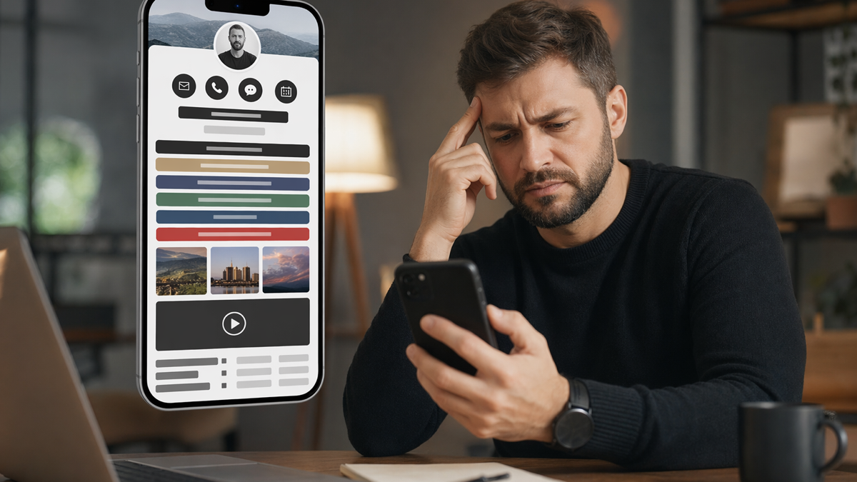
The most common problem is choice overload. A visitor lands on the page, sees twelve buttons, and has to work out which one matters. Most will not work that hard. They tap the first familiar thing, often a social profile, and disappear back into scrolling.
A better page has a hierarchy. One primary action, a few supporting links and the rest cut or pushed lower. If every link is treated as equally important, none of them is.
A practical example helps. Imagine the business prints this on 500 cards, adds it to a social profile and mentions it in customer messages. If the wording is vague or the destination is wrong, every channel repeats the same mistake. If the link is branded, editable and measured, the team can fix the route and learn from the result.
the copy is usually too vague
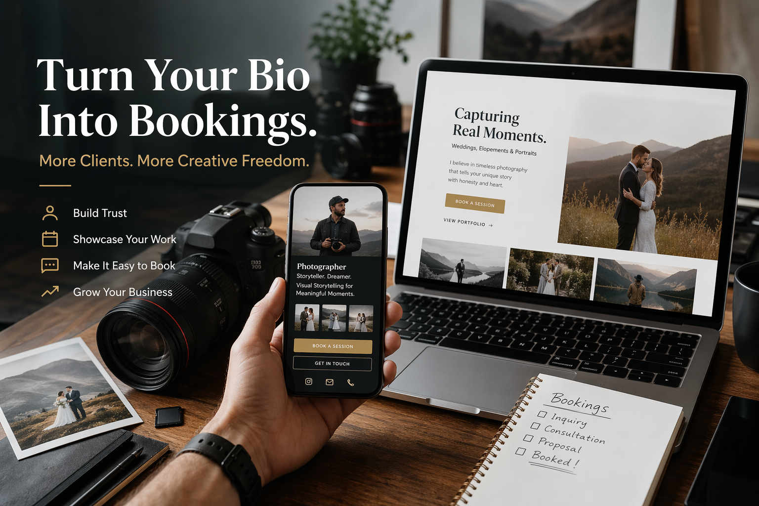
Buttons like "learn more", "our services" and "latest update" do not tell people what happens next. Specific labels perform better because they reduce uncertainty. "Book a discovery call" is clearer than "contact". "View the wedding gallery" is clearer than "portfolio".
Good link copy is plain. It names the outcome. You do not need clever wording; you need the visitor to recognise their next step in half a second.
A practical example helps. Imagine the business prints this on 500 cards, adds it to a social profile and mentions it in customer messages. If the wording is vague or the destination is wrong, every channel repeats the same mistake. If the link is branded, editable and measured, the team can fix the route and learn from the result.
the page ignores intent
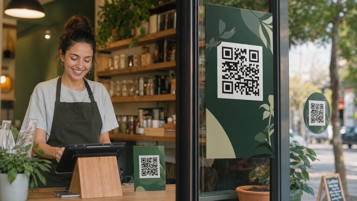
People arrive from different places with different intent. Someone from a paid advert may want the offer mentioned in the ad. Someone from Instagram may want the product in the latest post. Someone scanning a QR code at an event may want the event resource. Sending all of them to the same generic bio page wastes that context.
Create campaign-specific versions when the route matters. The main bio page can stay broad, but a QR code on a flyer should lead to the thing the flyer promised. A link in a post about bookings should not make people choose from a full menu of unrelated links.
A practical example helps. Imagine the business prints this on 500 cards, adds it to a social profile and mentions it in customer messages. If the wording is vague or the destination is wrong, every channel repeats the same mistake. If the link is branded, editable and measured, the team can fix the route and learn from the result.
weak visual order makes pages feel cheap
- Use the same tone and naming as your website or shop.
- Keep button styles consistent.
- Avoid huge images that slow the page.
- Check the page on a cheap phone, not only a large monitor.
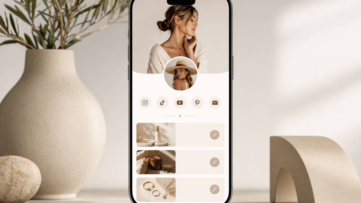
A bio page does not need to look like a full website, but it should feel intentional. Random colours, mismatched thumbnails and inconsistent button labels make a small business look less organised than it is. The page is often a first impression. Treat it accordingly.
Use fewer elements and make them work harder. One strong image, a clear sentence and a short set of links usually beats a crowded stack of widgets. Fast loading matters too. A beautiful page that drags on mobile data will lose people.
A practical example helps. Imagine the business prints this on 500 cards, adds it to a social profile and mentions it in customer messages. If the wording is vague or the destination is wrong, every channel repeats the same mistake. If the link is branded, editable and measured, the team can fix the route and learn from the result.
tracking is often missing or meaningless
Many bio pages report total views and total clicks. That is a start, but it does not tell you which channel sent valuable visitors. If Instagram, TikTok, email signatures and QR cards all point to the same page, separate links help you understand what is working.
The goal is not to stare at dashboards every day. The goal is to make better decisions. If nobody clicks the newsletter link for two months, remove it or rewrite it. If the booking link gets clicks but no bookings, the booking page needs attention.
A practical example helps. Imagine the business prints this on 500 cards, adds it to a social profile and mentions it in customer messages. If the wording is vague or the destination is wrong, every channel repeats the same mistake. If the link is branded, editable and measured, the team can fix the route and learn from the result.
how to fix an underperforming page in one afternoon
Start by choosing the one action you most want this month. Put it first. Rewrite the button with a specific verb. Remove expired links. Move social icons down. Add campaign-specific links for any QR code or advert that deserves its own route.
Then test the page like a stranger. Open it from the social profile, scan the printed QR code, tap the main button and complete the next step as far as you can. Most problems show up quickly when you stop looking at the page as its owner.
A practical example helps. Imagine the business prints this on 500 cards, adds it to a social profile and mentions it in customer messages. If the wording is vague or the destination is wrong, every channel repeats the same mistake. If the link is branded, editable and measured, the team can fix the route and learn from the result.
put it into practice
The safest approach is to start with one high-value action and build around it. Do not add links or codes because the tool allows it. Add them because they help a real customer do something useful.
If you want one place to create branded short links, editable QR codes and simple bio pages, create a free D2eak.link account and build your first campaign in a few minutes.
Review the setup after real people have used it. Remove what nobody taps. Rewrite anything that causes confusion. Keep the links and codes that clearly move people towards bookings, orders, enquiries or repeat visits.
write for the visitor who just arrived
A bio page visitor often comes from a tiny prompt: a profile link, a story sticker, a QR code or a short mention in a caption. They are not reading with patience. The first screen has to confirm they are in the right place and show the next useful action.
Avoid insider labels. A business may know that "studio notes" means the current product drop or that "client hub" means booking information, but new visitors will not. Use ordinary language. If the link is for booking, say booking. If it is for prices, say prices. Clarity is not boring when someone is trying to decide quickly.
remove links that only make the owner feel busy
Owners often keep links because each one represents work they did: a podcast appearance, an old campaign, a press mention, a launch page, a course, a dormant newsletter. The visitor does not care how much effort went into them. They care whether the page helps them do what they came to do.
Be ruthless for a week. Hide anything that has not earned clicks or revenue. If nobody complains, leave it hidden. A shorter page can feel braver than a long one because it forces the business to choose what matters now.
check the page against one honest question
Ask: if a good prospect landed here right now, would they know what to do next? If the answer is "probably", the page needs editing. Probably is where conversions go to die. The top link, the page title and the first sentence should all point in the same direction.
This does not mean every page must sell aggressively. A calm, useful page can work well. It simply needs to make a choice. If the purpose is booking, optimise for booking. If the purpose is email sign-ups, optimise for that. Mixing five purposes on one tiny page usually pleases nobody.
quick check before publishing
Before sending the page or code live, open it on a phone, follow the main action, and ask whether a first-time visitor would understand the next step without extra explanation. If the answer is no, cut one thing or rewrite the prompt before promoting it.
Related reading
If this topic is useful, these related D2eak.link guides are worth reading next: