
The useful question is not whether the tool exists
Most businesses already know they can create seasonal bio pages. The harder question is whether the way they use them makes the customer journey clearer.
This matters because businesses that change offers through the year but do not want to rebuild website pages every few weeks usually do not have the time or budget to rebuild every campaign from scratch. They need a practical layer between the marketing material and the destination page. That layer should be easy to update, easy to measure and tidy enough that customers trust it.
In everyday use, this touches Christmas bookings, summer offers, school-holiday deals, Black Friday bundles, local events and appointment availability. Each one may look like a small detail on its own. Together, they decide whether a person moves from mild interest to action, or gives up because the next step feels vague.
A good setup does not need to be complicated. It needs a clear job, a clear destination and a naming habit that people can still understand later.
Start with the visitor moment
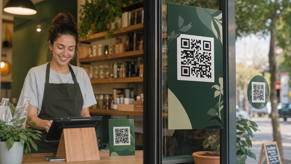
A link or QR code is not neutral. It appears in a specific moment. Someone may be standing outside a shop, reading an invoice, checking a business card, scrolling Instagram, or comparing suppliers after a meeting.
That moment should decide the page they see next. If the destination ignores the context, the campaign has already lost some of the attention it worked to earn.
For seasonal bio pages, the strongest pages usually match one promise from the source material. The wording on the printed card, social post or email should feel connected to the headline on the landing page. The visitor should not have to work out whether they arrived in the right place.
A quick test before you build anything
Before creating the route, write the sentence a visitor would say in their own head. It might be: I want to book this, I want the offer, I want the menu, I want the quote form, or I want to see proof before I enquire.
If the page does not answer that sentence quickly, simplify it. This is where many small campaigns improve without any design overhaul.
Where D2eak.link fits
D2eak.link is useful because it puts short links, QR codes, bio pages and tracking in one working layer. For businesses that change offers through the year but do not want to rebuild website pages every few weeks, that can be more useful than adding another standalone tool for every job.
The benefit is practical. You can create a cleaner route, change the destination when the offer changes, and still keep the public-facing link stable. You can also separate campaign sources so the reporting does not blur everything together.
- Create a branded short link for each important route.
- Use QR codes when the source is offline or physical.
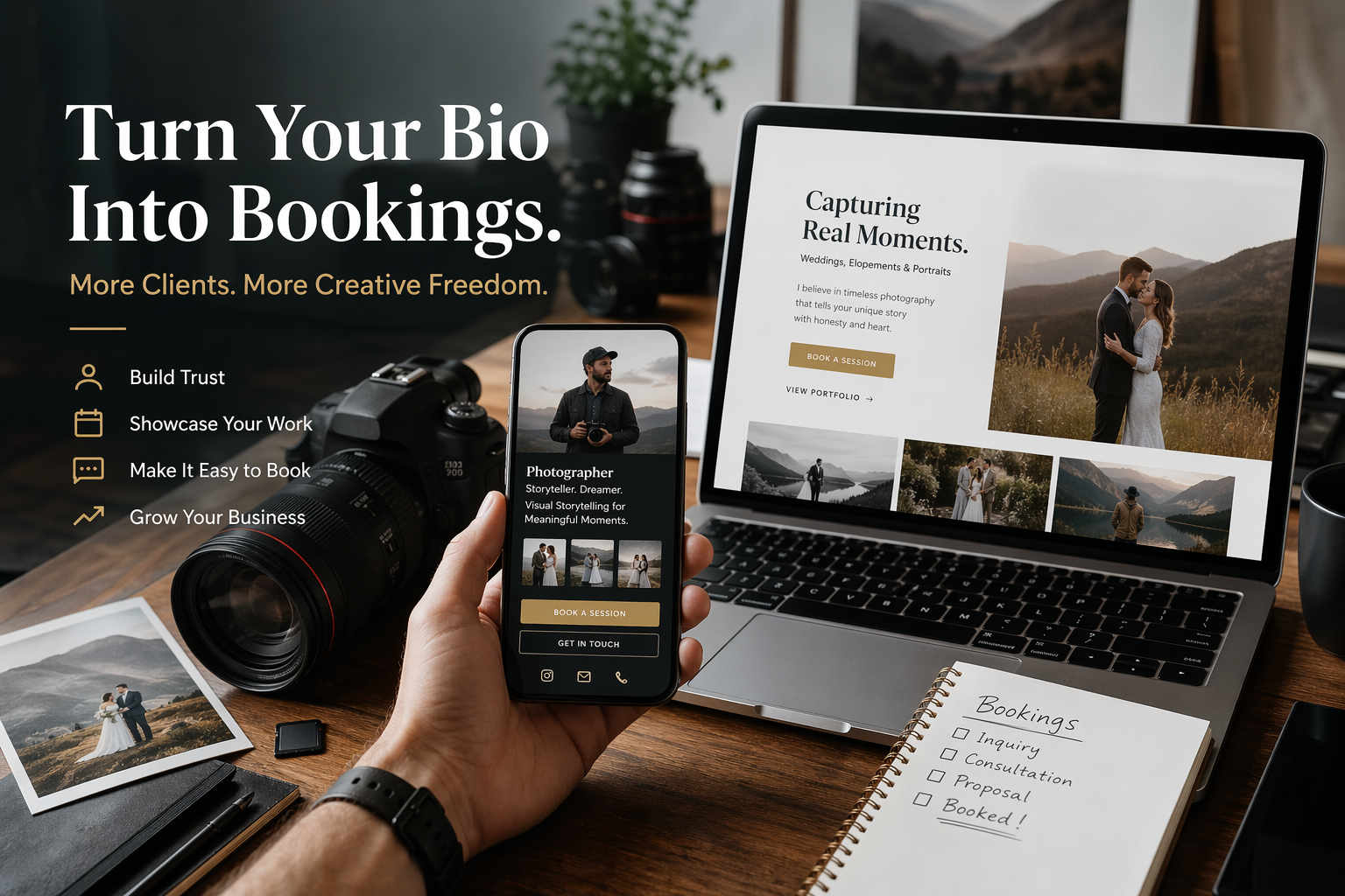
- Use bio pages when visitors need a small choice of next steps.
- Use clear campaign names so reporting still makes sense later.
- Update destinations when offers change instead of reprinting or reposting everything.
Build the journey backwards
The best way to avoid a messy setup is to work backwards from the action. Decide what a successful visit looks like, then build only what is needed to make that action likely.
For a booking campaign, the page should make availability, proof and the booking button easy to find. For a review request, the page should send people straight to the right review route. For an offer, the terms should be clear before the visitor taps the button.
A simple planning order
- Name the desired action.
- Choose the destination page or create a focused bio page.
- Create one short link or QR code for each meaningful source.
- Add the link to the printed, social or email placement.
- Check the journey on a phone before the campaign goes live.
This order keeps the campaign grounded. It stops the tool from driving the plan. The tool should support the journey, not become the journey.
What a clean setup looks like
A beauty salon could run a Christmas gift-card push from one bio page, then switch the same social profile link to January treatment packages later. The website stays stable while the offer layer changes.
The important part is that each route has a purpose. The business does not need a large technical stack. It needs a small amount of discipline: one route per important source, one main action per page, and one reporting view that can be understood later.
That also makes handover easier. If a team member, designer or agency picks up the campaign in three months, the links should explain themselves. A link called summer_menu_window_qr is easier to understand than a random code or a clever internal nickname.
This is where many small businesses get a real gain. They stop relying on memory. They can see which placements got attention, which pages moved people on, and which routes need a rewrite.
The mistakes that usually waste attention
Most weak link and QR journeys fail quietly. The campaign may look fine from the outside, but the visitor has to do too much work after they click or scan.
- Turning the bio page into a second homepage
- Leaving expired offers live
- Mixing old and new promotions
- Forgetting to update social profile links
- Hiding the booking route below too many options
None of these mistakes are dramatic. That is why they are easy to miss. A link that looks slightly untrustworthy, a QR code placed too low on a poster, or a landing page with five competing buttons can reduce action without producing an obvious error message.
The fix is usually smaller than people expect
You often do not need a new website. You need a better route. A focused page, a clearer CTA, a more readable short link, or a separate QR code for each placement can change the quality of the results without turning the project into a rebuild.
How to measure the right things
Clicks and scans are useful, but they are only the first part of the story. A campaign can get plenty of scans and still fail if visitors do not take the next step.
Review the numbers in context. A poster near a till may get fewer scans than a social post, but the people who scan it may be more ready to act. A bio page may get fewer clicks after you reduce the number of options, yet produce better enquiries because the choice is clearer.
A monthly review checklist
- Which source produced the most useful visits?
- Which link got attention but weak follow-through?
- Which destination page needs a clearer headline?
- Which old links or QR codes should be retired?
- Which campaign should be split into separate trackable routes next time?
This is the habit that turns campaign links from admin into learning. The business can keep improving the route instead of guessing what happened.
Make the public link feel trustworthy
Trust starts before the page loads. A link that looks random, overlong or unrelated to the brand can make people hesitate. That hesitation is small, but in low-attention moments it matters.
A branded short link is easier to read in print, easier to say out loud, and easier to recognise in an email or social caption. It also helps when the destination URL is long, full of tracking tags, or likely to change.
The goal is not to hide where the visitor is going. The goal is to make the route cleaner. The landing page should still deliver what the link promised, and the campaign name behind the scenes should still be clear enough for reporting.
Use the bio page as an offer layer, not a replacement website
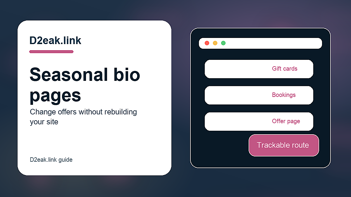
A seasonal bio page works best when it sits lightly on top of the main website. The website can keep the full service information, policy pages and evergreen content. The bio page can handle the short-lived push: one offer, one deadline, one obvious next step.
This is useful for small teams because it reduces the amount of editing needed on the main site. The seasonal page can change quickly, while the core website stays stable. It also keeps campaign traffic focused instead of sending visitors into a broad navigation menu.
Archive the offer when the season ends
Old offers create doubt. If a visitor lands on a Christmas booking page in February, they may wonder what else is out of date. Put a reminder in the calendar to switch the page, redirect the link or update the CTA before the offer expires.
Related reading
If you are planning this as part of a wider link or QR workflow, these guides are useful next steps:
- What a Better Link-in-Bio Funnel Looks Like in Practice
- Best Link in Bio CTA Examples for Small Businesses
Final recommendation
For businesses that change offers through the year but do not want to rebuild website pages every few weeks, the best first step is to tidy the journey you already have. Pick one live campaign or one recurring customer action. Give it a clearer route, a cleaner destination and separate tracking for each important source.
Do that before adding more channels. Better routing makes existing attention work harder. It also gives you a calmer way to improve future campaigns because you can see what people actually did.
Create cleaner short links, QR codes and bio pages with D2eak.link.
Once that basic system is in place, each new campaign becomes easier to launch and easier to judge. The work feels less like guessing and more like running a small, measurable process.