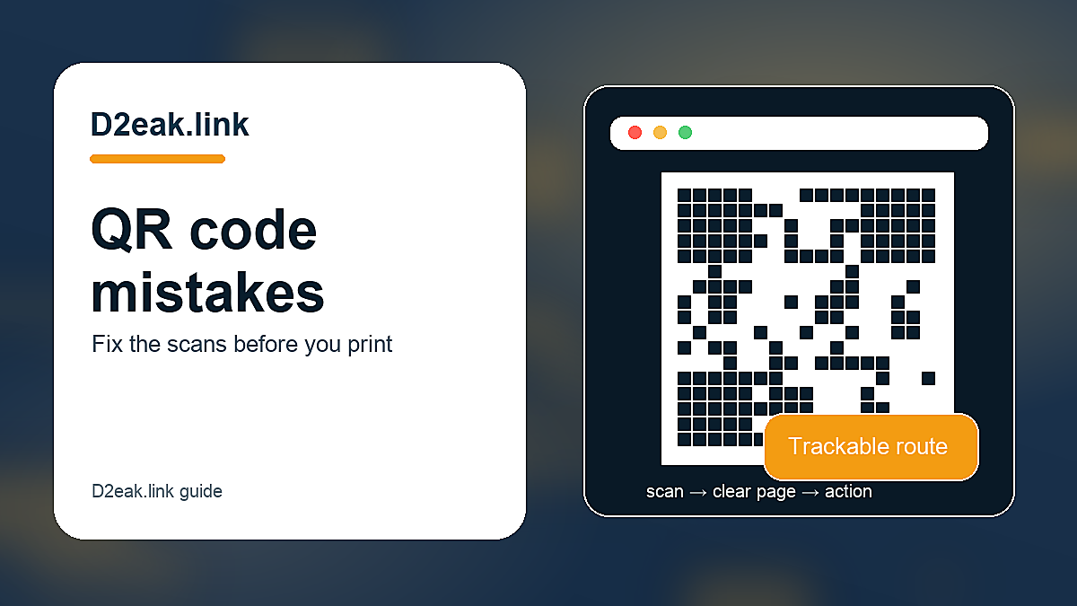


Most QR code problems are not technical. The code scans, the page opens and everyone assumes the job is done. Then hardly anyone uses it. Conversion usually dies because the code is in the wrong place, the reason to scan is weak, the page is slow, or nobody tracks which placement worked. Small fixes can make a big difference because scanning is already a tiny act of effort.
The details differ by business, but the pattern is the same: make the next step obvious, keep the destination editable where possible, and measure the channels that matter. A tidy setup beats a crowded one because customers are busy and impatient.
the code is too small or badly placed
- Test from the distance a customer will actually stand.
- Keep enough white space around the code.
- Avoid low contrast colours and patterned backgrounds.
- Do not place the code where glare is constant.
A QR code has to be scannable in the real setting, not only in the design file. Codes on busy posters, glossy table cards, curved packaging or tiny receipt corners often fail because nobody tested them at the actual size and distance.
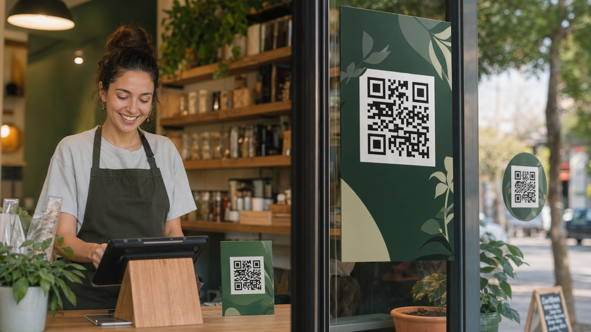
Placement is a conversion decision. Put the code where people naturally pause and where scanning does not feel awkward. A code beside a queue can work. A code on a moving door or hidden below the fold of a poster usually will not.
A practical example helps. Imagine the business prints this on 500 cards, adds it to a social profile and mentions it in customer messages. If the wording is vague or the destination is wrong, every channel repeats the same mistake. If the link is branded, editable and measured, the team can fix the route and learn from the result.
there is no clear reason to scan
People rarely scan out of curiosity. They scan because the reward is obvious: see the menu, claim the offer, book the slot, order again, get the guide, leave feedback. If the copy only says "scan me", the customer has to guess what is behind it.
Specific prompts feel more trustworthy. "Scan to see today’s lunch menu" beats "scan for more". "Scan to reorder your favourite" beats "visit our website". The promise should match the landing page exactly.
A practical example helps. Imagine the business prints this on 500 cards, adds it to a social profile and mentions it in customer messages. If the wording is vague or the destination is wrong, every channel repeats the same mistake. If the link is branded, editable and measured, the team can fix the route and learn from the result.
the landing page is wrong for mobile
- Open the page on mobile data, not just office Wi-Fi.
- Check that the main button is visible without hunting.
- Avoid forcing account creation before showing value.
- Keep forms short when the user is standing in public.
A QR scan almost always happens on a phone. Sending people to a slow homepage, a desktop PDF or a page with tiny form fields wastes the scan. The landing page should load quickly and put the promised action near the top.
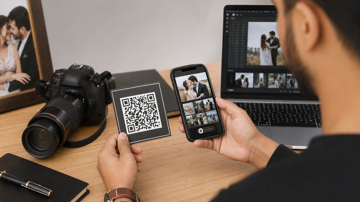
Restaurants should not send a reorder QR to the general homepage. Photographers should not send a wedding fair QR to a full archive. Shops should not send a product label QR to the entire catalogue. Match the scan to the next step.
A practical example helps. Imagine the business prints this on 500 cards, adds it to a social profile and mentions it in customer messages. If the wording is vague or the destination is wrong, every channel repeats the same mistake. If the link is branded, editable and measured, the team can fix the route and learn from the result.
one QR code is used for every placement
Using one code everywhere saves time at the start and creates confusion later. If scans increase, you will not know whether the window poster, receipt, table card, flyer or packaging caused it. That makes improvement difficult.
Create separate dynamic codes for important placements. They can all lead to the same destination, but the tracking should stay separate. Name the codes in plain language so reports make sense months later.
A practical example helps. Imagine the business prints this on 500 cards, adds it to a social profile and mentions it in customer messages. If the wording is vague or the destination is wrong, every channel repeats the same mistake. If the link is branded, editable and measured, the team can fix the route and learn from the result.
the destination cannot be changed
Static codes are risky for campaigns because printed material has a habit of lasting longer than the page behind it. A broken URL, changed offer or expired booking page can turn a useful asset into waste.
Dynamic QR codes solve this by keeping the printed code stable while the destination can be edited. For public campaigns, that flexibility is usually worth it. It is cheaper to update a dashboard than reprint signs.
A practical example helps. Imagine the business prints this on 500 cards, adds it to a social profile and mentions it in customer messages. If the wording is vague or the destination is wrong, every channel repeats the same mistake. If the link is branded, editable and measured, the team can fix the route and learn from the result.
nobody owns the follow-up
A QR code can generate scans while still failing commercially. Someone has to check results, update destinations, remove expired offers and ask whether scans turned into bookings, orders or enquiries. Otherwise the code becomes decoration.
Set a review date when the code is created. After two weeks or a month, check the numbers and make one change. Move the code, rewrite the prompt, improve the page or retire the placement. QR conversion improves through small edits, not wishful thinking.
A practical example helps. Imagine the business prints this on 500 cards, adds it to a social profile and mentions it in customer messages. If the wording is vague or the destination is wrong, every channel repeats the same mistake. If the link is branded, editable and measured, the team can fix the route and learn from the result.
put it into practice
The safest approach is to start with one high-value action and build around it. Do not add links or codes because the tool allows it. Add them because they help a real customer do something useful.
If you want one place to create branded short links, editable QR codes and simple bio pages, create a free D2eak.link account and build your first campaign in a few minutes.
Review the setup after real people have used it. Remove what nobody taps. Rewrite anything that causes confusion. Keep the links and codes that clearly move people towards bookings, orders, enquiries or repeat visits.
fix the offer before blaming the code
A perfectly scannable QR code cannot rescue a weak offer. If the prompt asks people to scan for "more information", most will ignore it because more information sounds like work. If it offers a clear menu, discount, booking slot, guide, reorder link or useful resource, the scan has a reason.
The offer should also match the setting. A commuter passing a poster may scan for a quick discount or timetable, not a long brochure. A diner at a table may scan for allergens or another round, not a corporate about page. A wedding fair visitor may scan for package examples, not a generic Instagram profile. Context decides whether the offer feels useful.
make the scan feel safe
Some people hesitate before scanning because they have seen too many suspicious codes in public places. Branding helps. A short line of copy, a recognisable domain and a landing page that matches the promise all reduce doubt. If the poster says one brand and the phone opens a completely different-looking page, trust drops.
Physical tampering is worth thinking about too. Codes on public posters can be covered with stickers. Check important placements regularly, especially in venues, high streets and shared noticeboards. A QR campaign is only as reliable as the object people are scanning.
track the boring details
Good QR tracking often looks boring: one code for the front window, one for receipts, one for table cards, one for packaging. Each has a plain name and a clear destination. That boring structure is what makes the report useful later.
If the campaign works, you will want to repeat it. If it fails, you will want to know why. Both outcomes need clean tracking. A pile of unnamed codes and screenshots will not help when the owner asks which print placement paid for itself.
Small businesses do not need complex attribution to improve. They need a clean link, a sensible name, a date, and enough discipline to compare placements before printing the next batch.
quick check before publishing
Before sending the page or code live, open it on a phone, follow the main action, and ask whether a first-time visitor would understand the next step without extra explanation. If the answer is no, cut one thing or rewrite the prompt before promoting it.
Related reading
If this topic is useful, these related D2eak.link guides are worth reading next: