
How to set up a high-converting bio page in 10 minutes
A good bio page does not need to be complicated. In fact, the complicated ones are usually the ones people abandon. The job is simple: help someone who already showed interest take the next useful step.
That person may have tapped your Instagram profile after seeing a Reel. They may have scanned a QR code on a flyer. They may have clicked a short link from a WhatsApp message. They arrive with a question in mind, even if they could not explain it clearly. Your page should answer that question quickly.
This guide gives you a 10-minute setup you can use for D2eak.link or any serious bio page tool. The examples are written for small businesses, creators, consultants, photographers, local shops and service providers. The same structure works for most campaigns because it starts with intent rather than decoration.
Before you open the page builder
Spend one minute deciding what the page is meant to do. This is where many bio pages go wrong. The owner adds every link they can think of, then wonders why visitors do not click the important one.
Your bio page should have a main job. Not five equal jobs. One main job. Secondary links are allowed, but they should not compete with the action that matters most this week.
Pick one main outcome
- Book a call.
- Buy a product.
- Join a mailing list.
- Send a WhatsApp message.
- Reserve a table.
- Download a guide.
- View a limited offer.
Write the outcome in plain English. "Get more leads" is too vague. "Get wedding photography enquiries through WhatsApp" is better. "Send cafe customers to the lunch menu" is better. Specificity makes the page easier to build and easier to measure.
Minute 1: write the headline
The headline should tell visitors they are in the right place. It does not need to be clever. It needs to connect the traffic source to the action.
If your Instagram post talks about a new product drop, the headline should mention the product drop. If your QR code is on a salon window, the headline should help people book or browse services. If your flyer offers a discount, the headline should repeat that offer.
Good headline examples
- Book your spring portrait session
- Order this week's lunch special
- Get the free pricing guide for small business websites
- Reserve a table for Friday or Saturday
- Message me about wedding availability
Avoid vague headlines such as "all my links" or "welcome to my world" if you are trying to convert. They may feel friendly, but they do not help a visitor decide what to do.
Minute 2: add a short intro
Use one or two short sentences under the headline. The intro should remove doubt, not introduce your life story. Give enough context for a cold visitor to trust the next click.
For a photographer, that might be: "Natural family and wedding photography across Manchester. For availability, send your date and venue." For a restaurant: "Fresh pasta, lunch deals and evening bookings in Bristol. Menus update weekly." For a coach: "Strength coaching for busy adults who want simple plans and proper support."
What to include
- Who the page is for.
- What they can get here.
- Any important location, date or limit.
- A reason to click now if the offer is time-sensitive.
Keep it human. People can smell brochure language. If you would not say the sentence out loud to a customer, rewrite it.
Minute 3: choose the primary button
The primary button is the most important part of the page. It should sit near the top and use direct wording. "Learn more" is often weak because it asks people to do extra work before they know why.
Use verbs that match the action. Book, order, message, join, download, reserve, view, claim. If the next step is WhatsApp, say so. If the next step is checkout, say so. Clear beats cute.
Better button labels
- Book a 20-minute call
- Send a WhatsApp enquiry
- View the lunch menu
- Buy tickets for Saturday
- Download the price guide
- Reserve your appointment
The button should match the page headline. If the headline says "book your spring portrait session", the primary button should not say "website". Send people exactly where they expect to go.
Minute 4: add two or three supporting links
Supporting links are useful, but only if they support the main action. A common mistake is adding too many buttons because the tool makes it easy. Each extra option adds a little hesitation.
Choose the links a real visitor might need before they convert. For a service provider, that could be prices, examples and reviews. For a restaurant, it might be menu, bookings and directions. For a creator, it might be latest video, shop and newsletter.
A clean order
- Primary action: the thing you most want visitors to do.
- Proof or detail: reviews, portfolio, menu, pricing or examples.
- Contact option: WhatsApp, email or booking calendar.
- Lower priority links: socials, older content or general website pages.
Put social links at the bottom unless they are the point of the page. Sending someone from Instagram to your Instagram grid is usually a loop, not a conversion path.
Minute 5: add proof without clutter
Proof helps when the visitor does not know you yet. You do not need a huge testimonial wall. One short review, a recognisable client name, a result, or a small line about experience can be enough.
For local businesses, proof can be practical. "Over 400 bookings from local families" is more useful than "passionate about excellence". For a consultant, a short case result may work better than a long paragraph. For a photographer, a small gallery link can carry more weight than any sentence.
Proof ideas
- A one-line customer review.
- A portfolio link labelled by service type.
- A booking count, years in business or number of projects.
- A press mention only if your audience will recognise it.
- A before-and-after example if the service is visual.
Do not make claims you cannot support. A plain, believable proof point is better than a grand one that feels inflated.
Minute 6: set up tracking
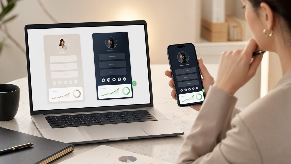
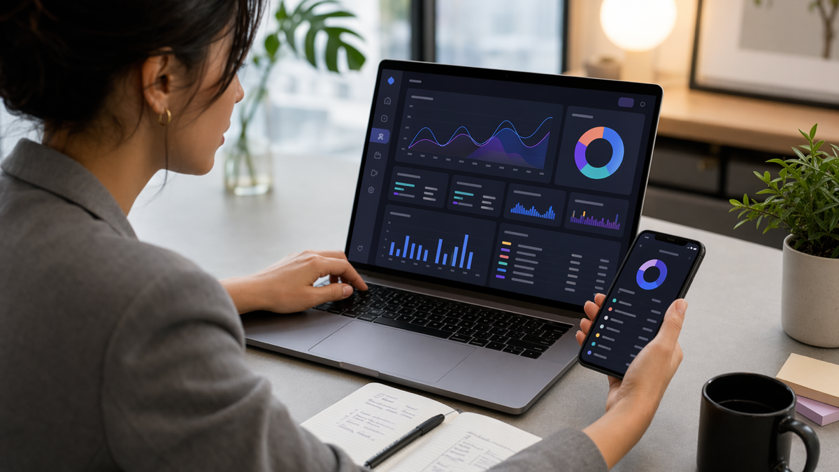
Tracking turns the page from a static link list into something you can improve. You do not need a complicated analytics stack to start. You do need to know where visitors came from and which links they clicked.
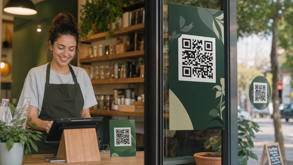
With D2eak.link, keep your campaign names tidy from the start. Use names you will understand in three months. "ig-bio-may-offer" is better than "test2". If you create QR codes for print materials, name them after the placement, such as "salon-window-qr" or "table-card-lunch-menu".
Simple tracking setup
- Create one bio page for the campaign or main profile.
- Create short links for important traffic sources.
- Use separate QR codes for separate physical placements.
- Check primary button clicks, not only page views.
- Review results after the page has enough visits to mean something.
The goal is not to stare at numbers every day. The goal is to know what to change when the page underperforms.
Minute 7: check the mobile experience
Most bio page traffic is mobile. Build for thumbs, not desktop screenshots. Open the page on your phone and look at it like a stranger would.
Can you see the main action without scrolling far? Are the button labels readable? Does the page load quickly on mobile data? Does the next page work properly on a phone? A beautiful bio page is wasted if the booking form after the click is awkward.
Mobile checks
- The primary button appears near the top.
- Buttons have enough spacing for easy tapping.
- The intro is short enough to scan.
- The destination page is mobile-friendly.
- WhatsApp, phone and map links open correctly.
If something feels fiddly, simplify it. Mobile visitors are not patient with forms that pinch, zoom or ask for too much too soon.
Minute 8: remove anything stale
Old links quietly damage trust. A Christmas offer in February, an unavailable booking slot, an old product launch or a dead social link all tell visitors the page is not being looked after.
Before you publish, remove or move anything that does not serve the current goal. This is where a lot of conversion improvement comes from. You are not adding magic. You are removing friction.
Cut these first
- Expired offers.
- Duplicate links to the same destination.
- Links with vague labels.
- Social links that pull people away from the main action.
- Buttons added "just in case".
If you are nervous about deleting a link, move it lower for a week and watch the numbers. If nobody clicks it, it probably did not belong near the top.
Minute 9: publish and test every click
After publishing, tap every button yourself. This sounds obvious, but broken links are common. Test on mobile and desktop if the next step matters. Send the page to one person who has not seen it and ask what they think the main action is.
If they cannot answer in a few seconds, the page is trying to do too much. Change the headline, move the main button up or cut a distracting link. Do not overthink it. The first version only needs to be clear enough to start collecting useful behaviour.
Minute 10: plan the first improvement
A bio page is not finished when it goes live. It is finished when it stops being useful. The first improvement should be small: change a button label, adjust the order, create a separate QR code for a new placement, or rewrite a headline to match a campaign.
Give each change time. If you change five things at once, you will not know what helped. A practical rhythm is to review the page once a week during active campaigns and once a month during quieter periods.
A 10-minute example
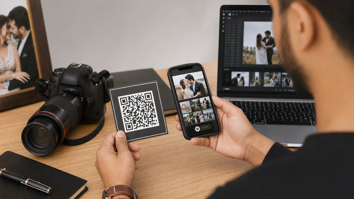
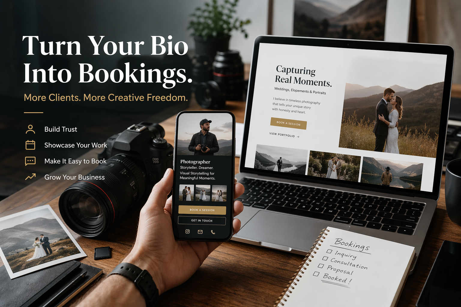
Say you are a wedding photographer and you want more enquiries for 2026 dates. Your page might look like this:
- Headline: "Check wedding photography availability for 2026"
- Intro: "Natural wedding photography across Yorkshire. Send your date and venue and I will reply with availability."
- Primary button: "Message me on WhatsApp"
- Supporting link: "View full wedding galleries"
- Supporting link: "Download the pricing guide"
- Proof: "Rated 5 stars by couples across Leeds, York and Harrogate"
That page is not fancy, but it has a job. It gives the visitor a reason to stay, a reason to trust you and a clear next action. You can then use a D2eak.link QR code on wedding fairs materials and a short link in Instagram Stories, with each source tracked separately.
Build the first version today
High-converting bio pages are usually built from boring decisions made well: clear headline, useful proof, one main button, clean tracking and no stale links. The page does not need to impress other marketers. It needs to help your visitor take the next step.
Create your D2eak.link account and build a bio page you can publish, test and improve in the next 10 minutes.
Keep it simple, then make it smarter
Your first version will not be perfect. That is fine. A live page with clear tracking beats a perfect draft that never goes anywhere. Start with the main action, measure the clicks that matter, and improve one thing at a time.
The best bio pages feel obvious to visitors. They do not make people decode your business. They meet the moment, show the next step and get out of the way.
Related reading
If this topic is useful, these related D2eak.link guides are worth reading next: