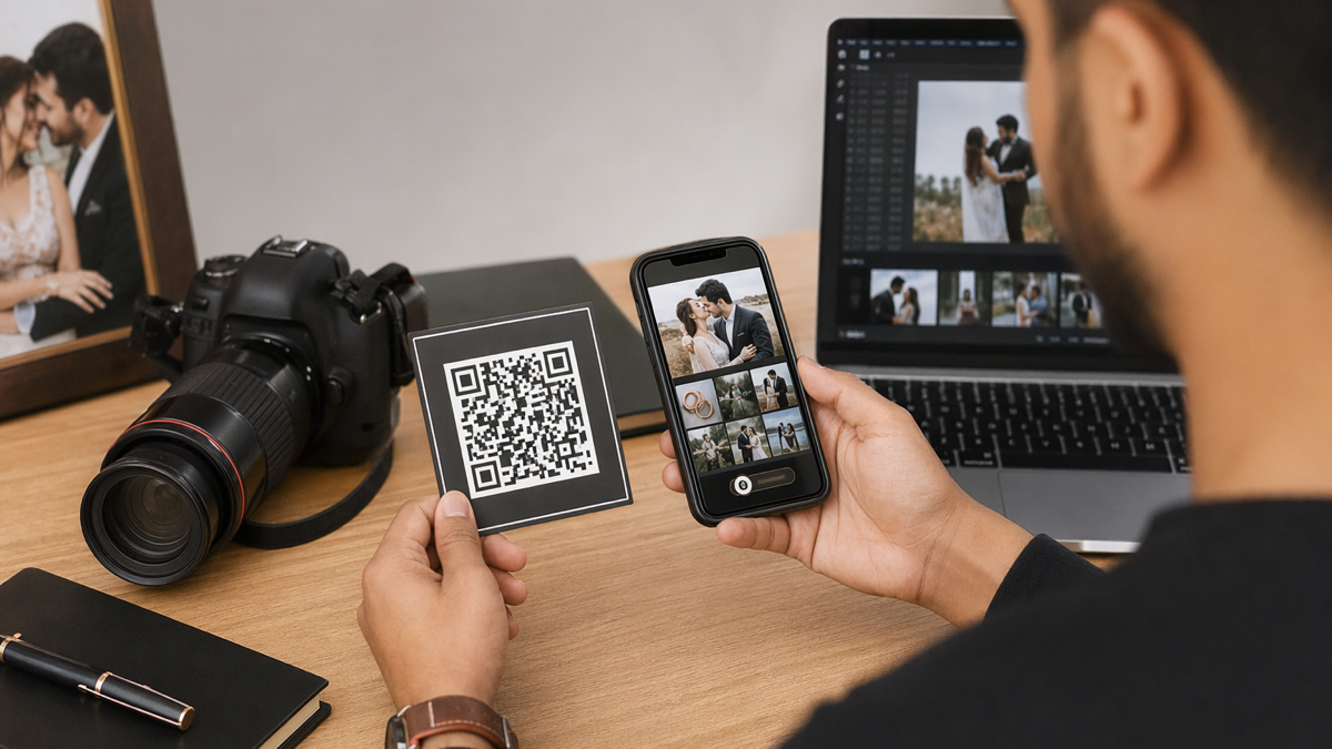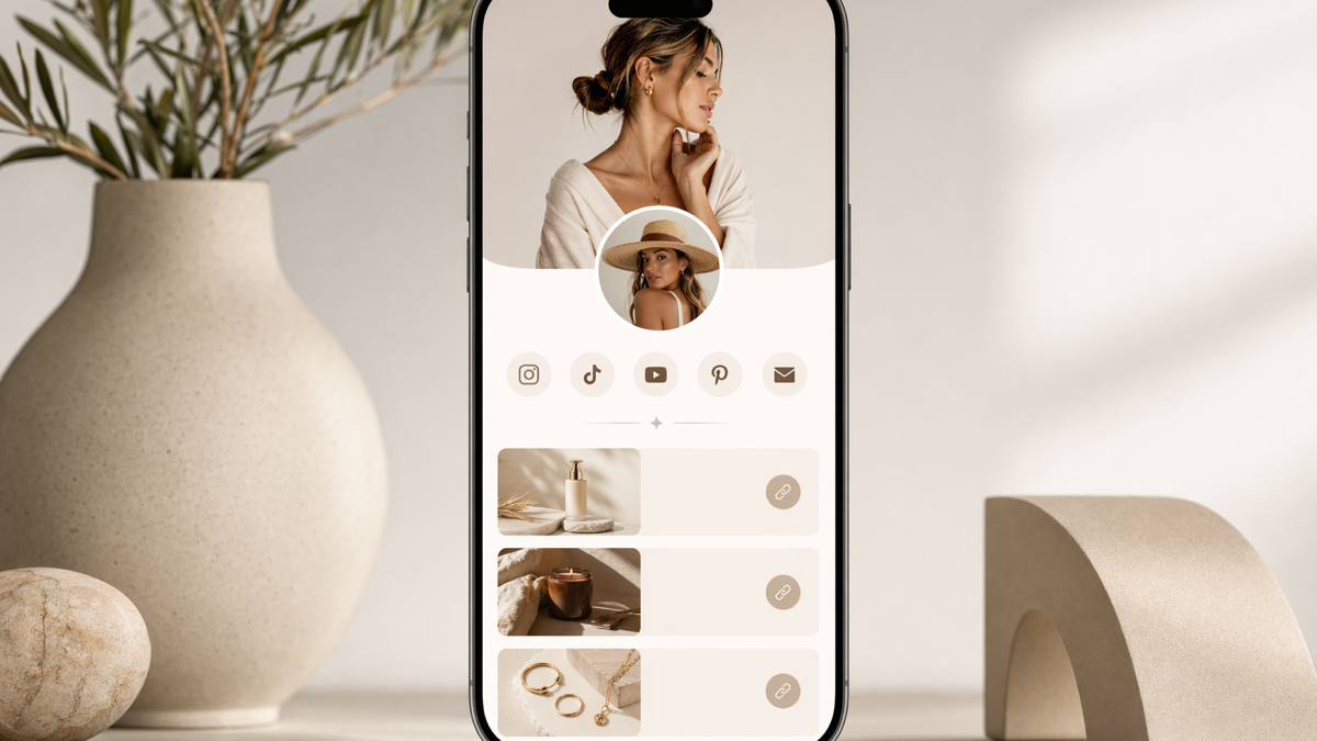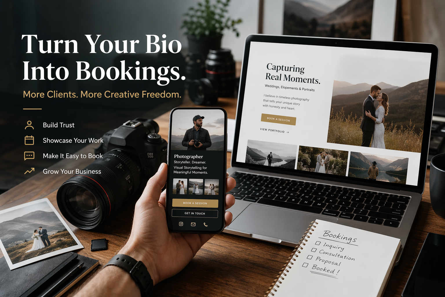

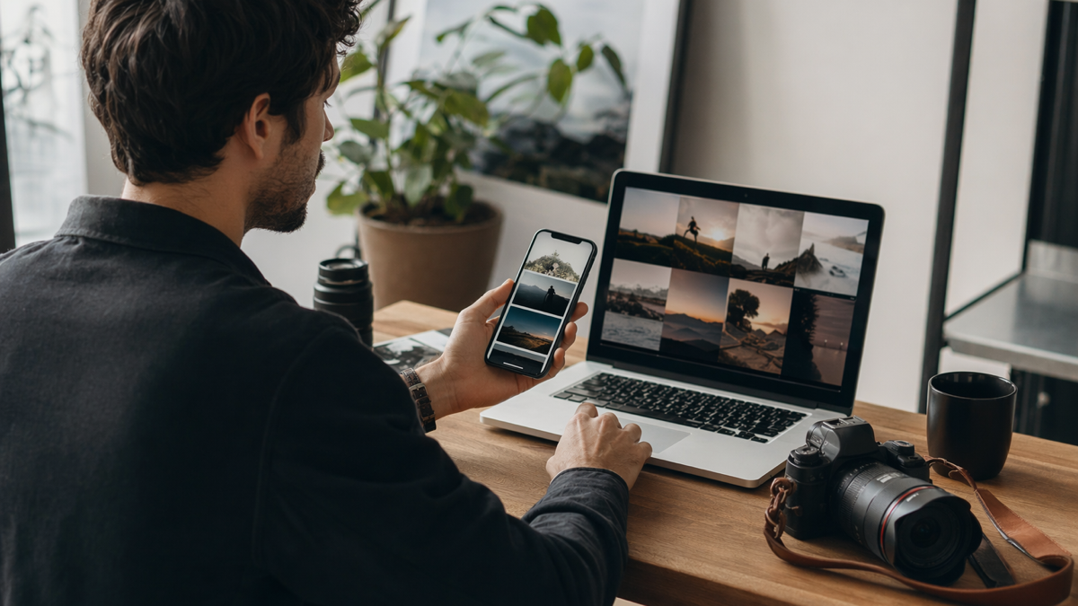
Photographers have a particular problem with bio links. A standard list of buttons is rarely enough. You need to show your work quickly, route different clients to the right place, make booking feel easy, and still keep the page light enough to open on a phone in a noisy wedding fair or from an Instagram profile. The best tool is not always the prettiest one. It is the one that turns attention into enquiries without making your portfolio feel cheap.
The details differ by business, but the pattern is the same: make the next step obvious, keep the destination editable where possible, and measure the channels that matter. A tidy setup beats a crowded one because customers are busy and impatient.
what photographers need from a bio link
- Portfolio preview near the top, not hidden three taps down.
- A booking or enquiry button that is easy to find.
- Separate routes for weddings, portraits, events and commercial work.
- Links to galleries, pricing guides and client proofing where relevant.
- Tracking so you can see what Instagram, fairs and QR cards actually send.
A photographer needs more than a neat stack of links. The page has to answer the questions a potential client has in the first minute: do I like this style, do they shoot what I need, where are they based, what happens next, and how do I enquire without feeling trapped in a sales funnel?
The page also needs to serve different audiences. A bride, a commercial client, a parent looking for family portraits and a gallery visitor do not all need the same next step. A strong bio page gives each person a clear route without turning the screen into a directory.
A practical example helps. Imagine the business prints this on 500 cards, adds it to a social profile and mentions it in customer messages. If the wording is vague or the destination is wrong, every channel repeats the same mistake. If the link is branded, editable and measured, the team can fix the route and learn from the result.
what to look for in a 2026 tool
- Mobile-first page templates with fast loading.
- Custom colours and enough visual control to feel on brand.
- Branded short links for galleries and offers.
- Editable QR codes for cards, stands and packaging.
- Simple analytics broken down by link or campaign.
The better tools in 2026 combine a bio page with short links, QR codes and basic analytics. That matters because photographers market in scattered places: Instagram, TikTok, Pinterest, printed cards, venue brochures, wedding fairs and referral emails. If each channel uses a separate tool, the admin becomes annoying fast.
Look for editing speed as well. Your page will change during the year. Mini sessions, Christmas shoots, autumn weddings, newborn availability and corporate headshot days all need quick updates. If changing the top offer feels like rebuilding a website, you will postpone it.
A practical example helps. Imagine the business prints this on 500 cards, adds it to a social profile and mentions it in customer messages. If the wording is vague or the destination is wrong, every channel repeats the same mistake. If the link is branded, editable and measured, the team can fix the route and learn from the result.
where simple list tools fall short
Basic bio tools are fine for creators who only need to point followers at recent content. Photographers usually need more trust. A prospective client wants to see real work, not just a button labelled portfolio. They also want some sense of price, availability and personality before they enquire.
A page with ten identical buttons creates friction. People read the first few, skip the rest and often tap the safest option, which is usually Instagram. That sends them back into distraction instead of moving them towards a booking.
A practical example helps. Imagine the business prints this on 500 cards, adds it to a social profile and mentions it in customer messages. If the wording is vague or the destination is wrong, every channel repeats the same mistake. If the link is branded, editable and measured, the team can fix the route and learn from the result.
a practical layout that works
- Lead with the service people ask for most.
- Use verbs: view wedding packages, book a portrait call, see commercial work.
- Keep social links at the bottom unless social proof is the goal.
- Remove expired mini session links immediately.
Start with one strong image or a tight grid, then a plain sentence about what you shoot and where. Put the main enquiry route immediately after that. The top of the page should not make people hunt. If you run seasonal offers, place the current one below the main enquiry button, not above everything forever.
After the top section, split links by client intent. Weddings, portraits and commercial work can each have their own button or short section. Keep archive links lower down. Your old blog post, press feature or favourite YouTube interview may matter to you, but it probably should not outrank the booking route.
A practical example helps. Imagine the business prints this on 500 cards, adds it to a social profile and mentions it in customer messages. If the wording is vague or the destination is wrong, every channel repeats the same mistake. If the link is branded, editable and measured, the team can fix the route and learn from the result.
tool recommendations by use case
Choose a visual portfolio-first option if your website is not ready and you need the page to carry your style. Choose a link management option if you already have a website but need better routing, QR codes and tracking. Choose a booking-led option if your work is mostly sessions with clear slots and prices.
D2eak.link fits photographers who want a lightweight page plus branded links and QR campaigns without juggling separate dashboards. It is not a replacement for a full portfolio site with deep galleries, but it is useful as the front door from social profiles, printed cards and short seasonal campaigns.
A practical example helps. Imagine the business prints this on 500 cards, adds it to a social profile and mentions it in customer messages. If the wording is vague or the destination is wrong, every channel repeats the same mistake. If the link is branded, editable and measured, the team can fix the route and learn from the result.
how to measure whether it is working
- Track Instagram bio taps separately from printed QR scans.
- Give each seasonal offer its own short link.
- Move the most clicked useful link higher.
- Cut links that get attention but never lead to enquiries.
Do not judge the page by views alone. Look at which links get taps and which enquiries mention the page. If the portfolio button gets all the traffic but enquiries stay low, the portfolio may not be leading people back to action. If the pricing guide gets taps but no replies, the offer may need clearer next steps.
Run small tests. Put a QR code on wedding fair cards that leads to a fair-specific page. Use a different short link in your Instagram bio. Track the difference for a month. You are looking for useful patterns, not perfect attribution.
A practical example helps. Imagine the business prints this on 500 cards, adds it to a social profile and mentions it in customer messages. If the wording is vague or the destination is wrong, every channel repeats the same mistake. If the link is branded, editable and measured, the team can fix the route and learn from the result.
put it into practice
The safest approach is to start with one high-value action and build around it. Do not add links or codes because the tool allows it. Add them because they help a real customer do something useful.
If you want one place to create branded short links, editable QR codes and simple bio pages, create a free D2eak.link account and build your first campaign in a few minutes.
Review the setup after real people have used it. Remove what nobody taps. Rewrite anything that causes confusion. Keep the links and codes that clearly move people towards bookings, orders, enquiries or repeat visits.
mistakes photographers should avoid
The first mistake is making the bio page behave like a storage cupboard. Client galleries, supplier links, old press mentions, every social network and three different enquiry forms do not belong at the top together. If a link is mainly useful to existing clients, label it clearly and move it below the new-client path.
The second mistake is hiding the price conversation too deeply. You do not need to publish every package, but a guide price or "packages from" link can save both sides time. Photographers sometimes fear that price clarity will put people off. It will put the wrong people off, which is useful. The right people will appreciate not having to guess before enquiring.
quick check before publishing
Before sending the page or code live, open it on a phone, follow the main action, and ask whether a first-time visitor would understand the next step without extra explanation. If the answer is no, cut one thing or rewrite the prompt before promoting it.
Related reading
If this topic is useful, these related D2eak.link guides are worth reading next: